Project
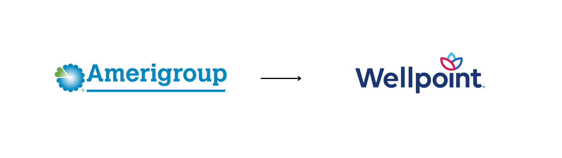
Transitioning Trust: The Amerigroup to Wellpoint Rebrand
Role
Senior Designer – Concept, Execution, Vendor Coordination
Tools
Adobe InDesign
Adobe Illustrator
Adobe Photoshop
Adobe Animate
Timeline
2022 – 2025
Story Design & Information Architecture
This project required translating a major healthcare rebrand into clear, accessible information experiences for Medicaid members. The challenge was not simply introducing a new name—it was helping diverse audiences understand changes to their healthcare coverage through thoughtful content hierarchy, visual systems, and audience-centered communication across hundreds of touchpoints.
The Challenge
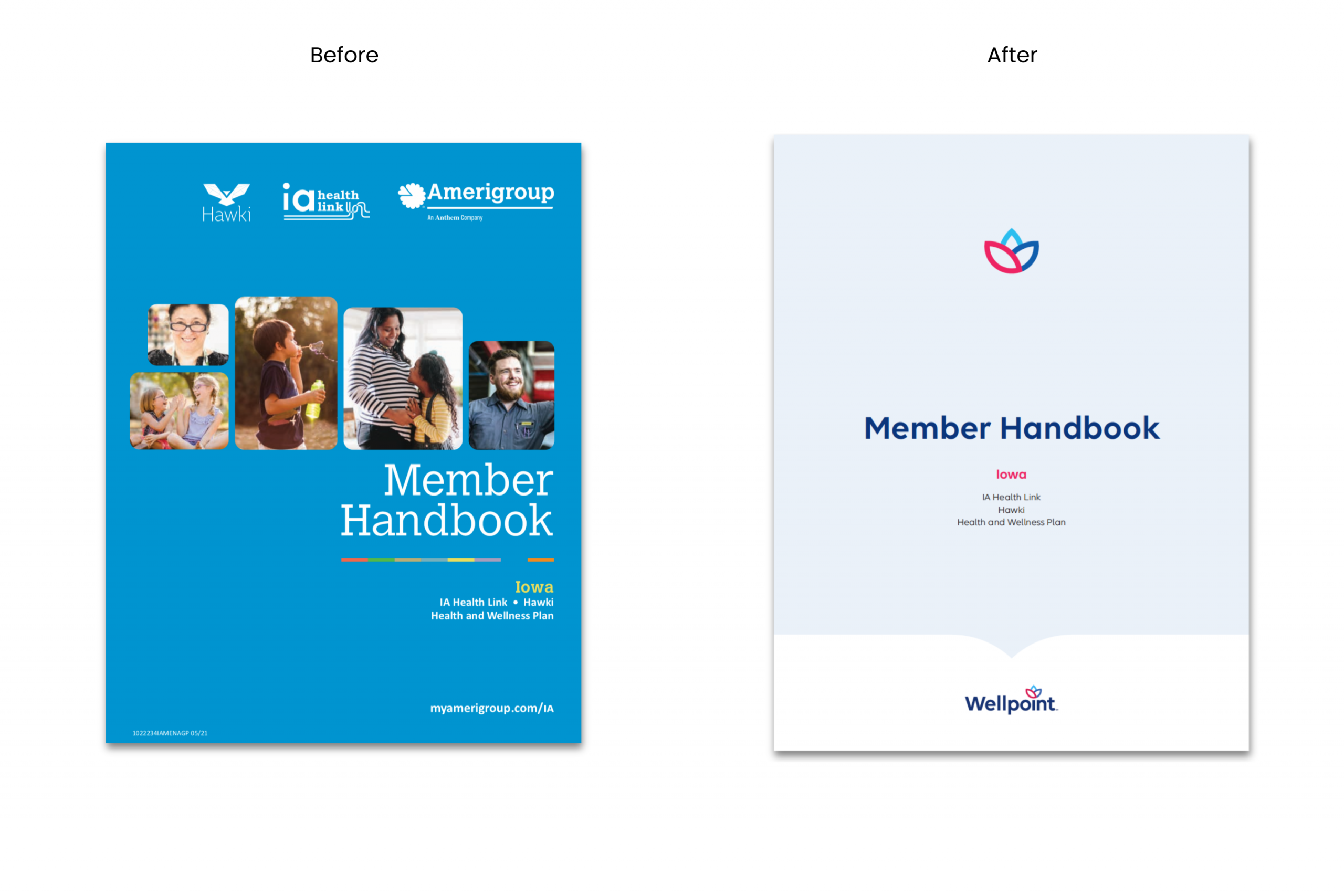
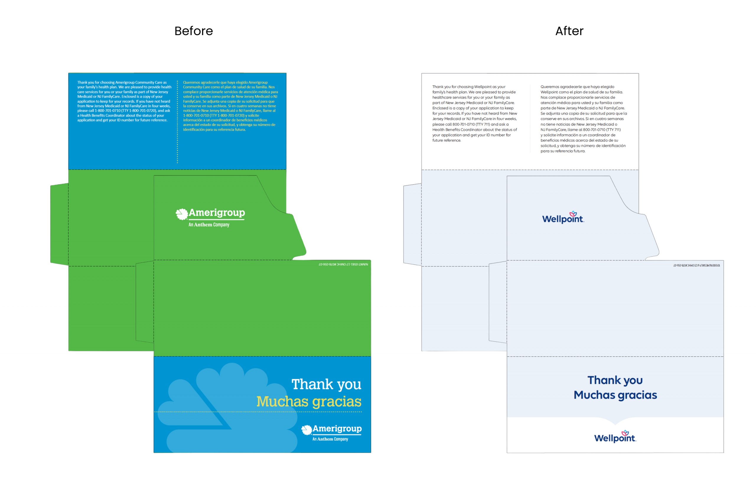
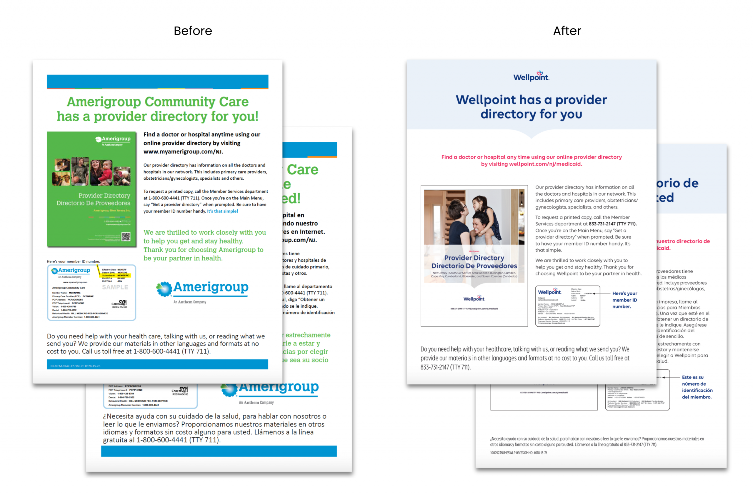
As Amerigroup evolved into Wellpoint, I led the visual transition across a wide range of Medicaid-facing communications. Our goal was to bring the new identity to life in a way that felt warm, inclusive, and accessible, especially for members from low-income communities.
The challenge went beyond updating logos. It required a full visual and tonal shift that honored the sensitivities of our audience. Every element, from stock photography and typography to layout and iconography, needed to balance professionalism with approachability.
As lead designer, I worked across more than twice the number of deliverables compared to our Anthem rollout. I translated the new Wellpoint identity into brochures, emails, social graphics, in-office posters, flyers, and more. I applied a rigorous lens to imagery selection, avoiding anything aspirational or out of touch, such as luxury interiors or expensive tech. Instead, I prioritized authentic, everyday visuals that reflected the dignity and diversity of our members’ lives.
My Role
As the lead designer, I brought Wellpoint’s visual identity to life across more than 100 real-world touchpoints. From printed brochures and mailers to digital campaigns and in-office signage, I ensured each piece aligned with the brand’s compassionate tone and consistent visual language. I partnered closely with writers, project managers, and brand teams throughout the multi-year rollout to maintain cohesion across every channel.
The Process
I collaborated regularly with creative directors, project managers, copywriters, compliance partners, and strategy teams to align on creative briefs, timelines, and objectives. I participated in weekly working sessions and kickoff calls to understand each audience and ensure the visual tone matched the brand’s evolving voice.
Over the course of three years, I supported the development of more than 100 branded assets spanning print, digital, and environmental formats. I built adaptable layout systems and modular templates that helped regional teams apply the new identity quickly and consistently across markets.
The Solution
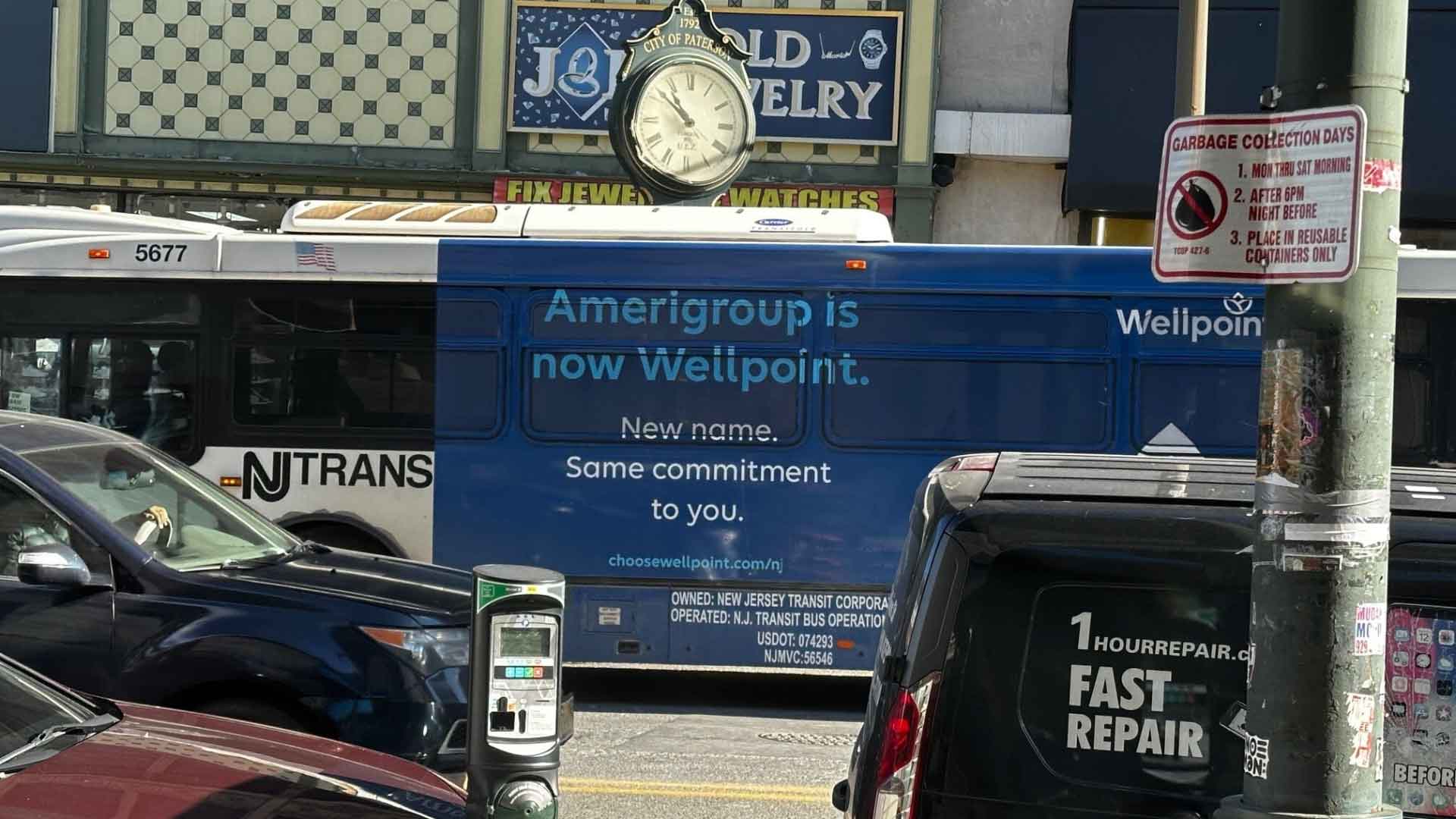
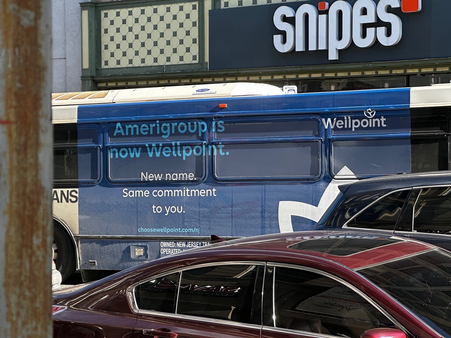
To introduce the Wellpoint brand to the public, I led the creative development of a large-scale NJ Transit bus wrap. This moving billboard brought Wellpoint’s new identity into high-traffic urban areas, helping raise brand awareness among millions of Medicaid members and the general public. I worked closely with brand and compliance teams to ensure the design met visibility, messaging, and legal requirements while remaining clear and impactful in motion.
Beyond transit, I developed a full system of member-facing print and digital assets — including brochures, flyers, posters, social media graphics, web banners, and internal documents. Each deliverable was designed to communicate clearly, feel approachable, and build trust with Medicaid audiences.
To support long-term scalability, I created reusable design systems and flexible templates that allowed production teams to execute quickly and consistently across regional markets. These systems became foundational for how Wellpoint’s visual identity was implemented nationwide.
Real-World Results:
-
Increased brand visibility during Anthem’s public-facing rebrand
-
Designed for scale, clarity, and movement
-
Seen daily by thousands of pedestrians and drivers in key urban centers
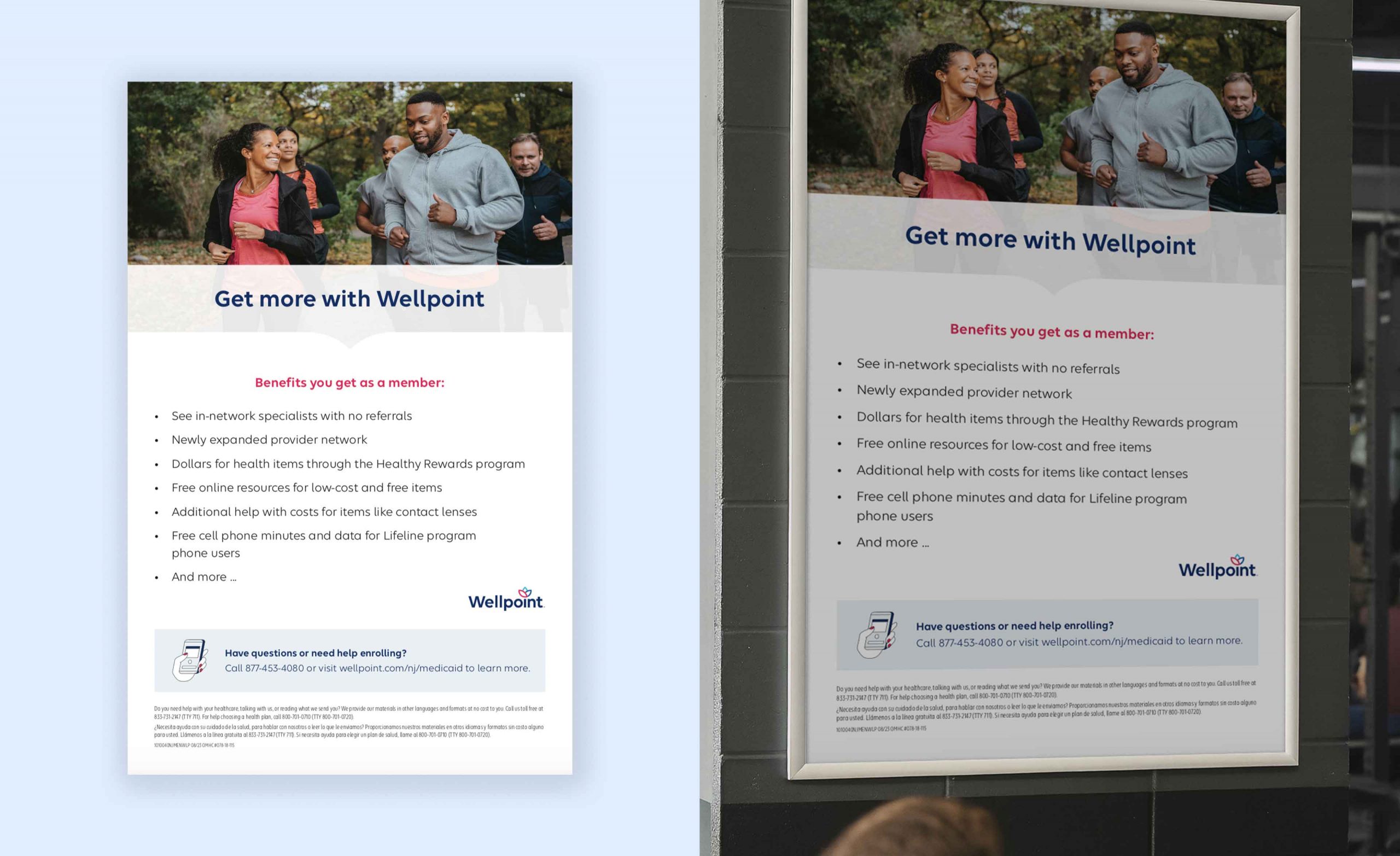
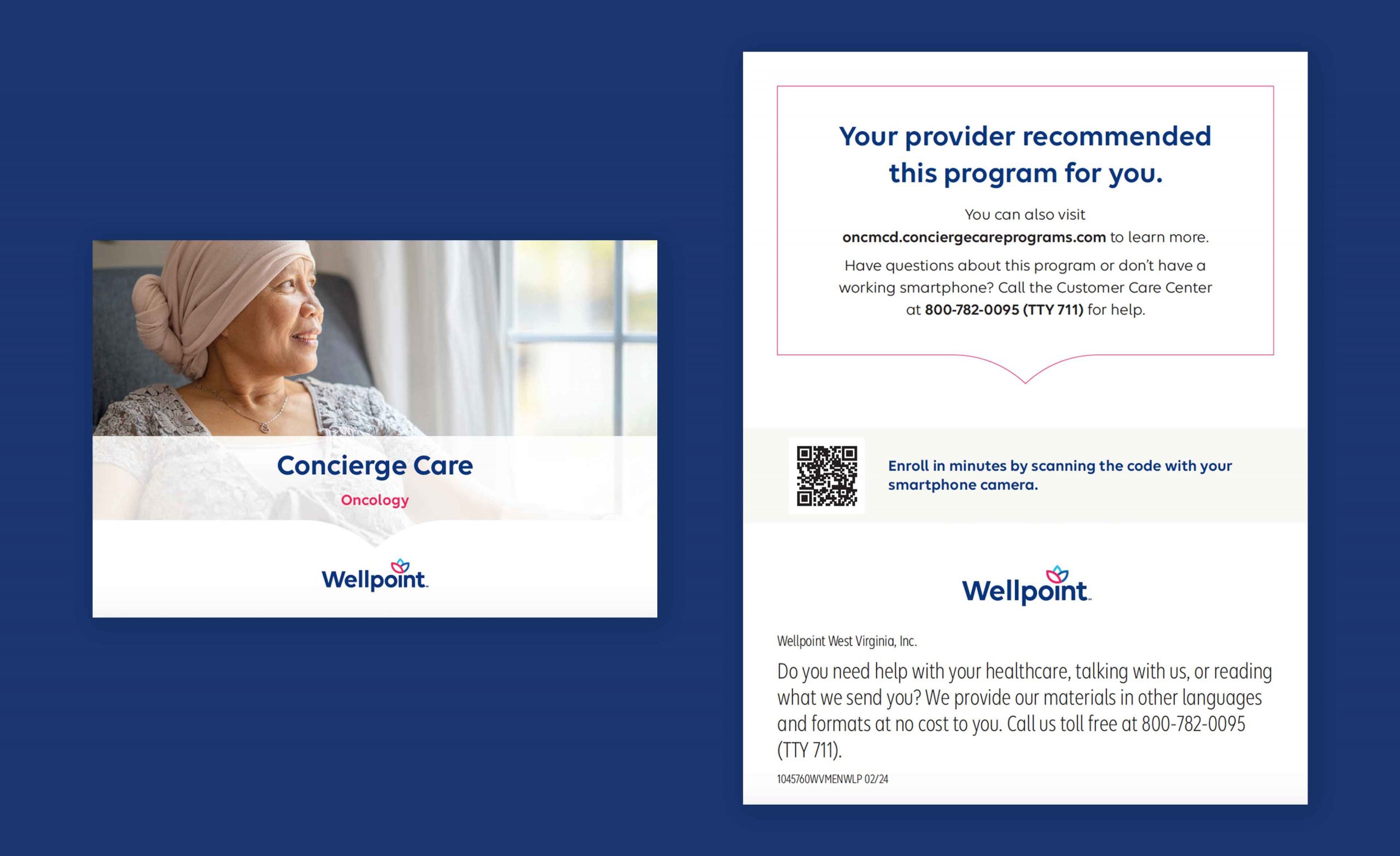
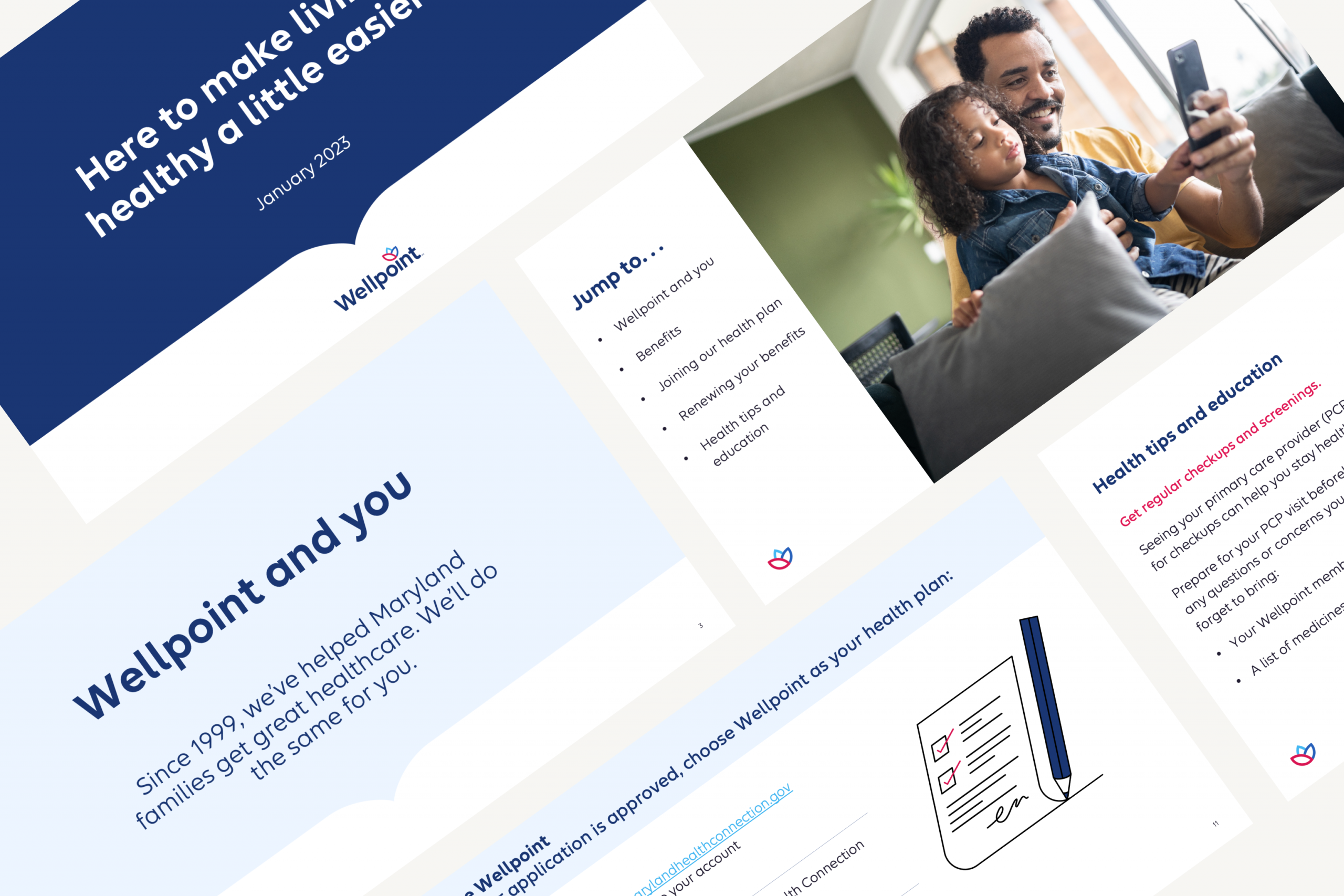
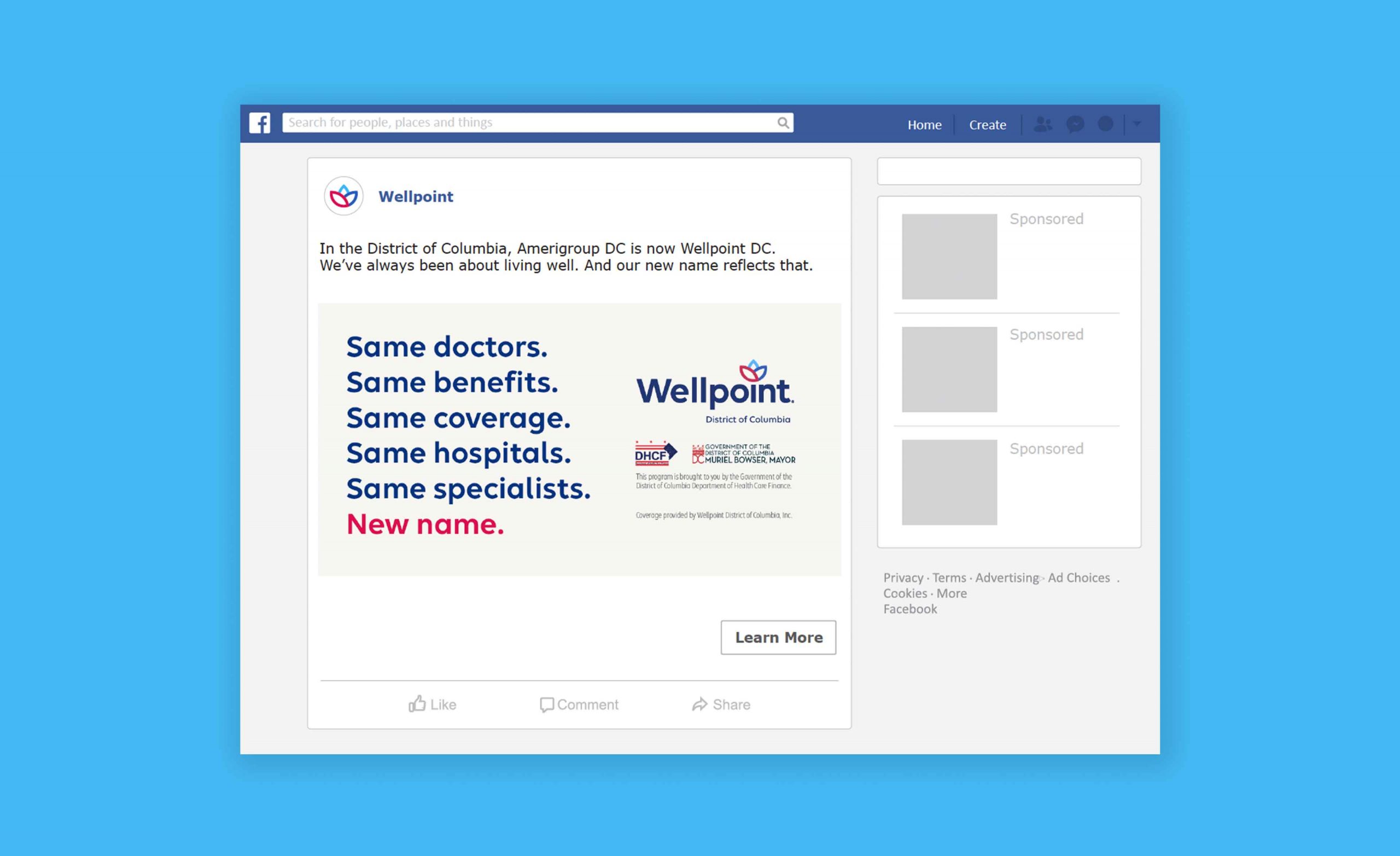
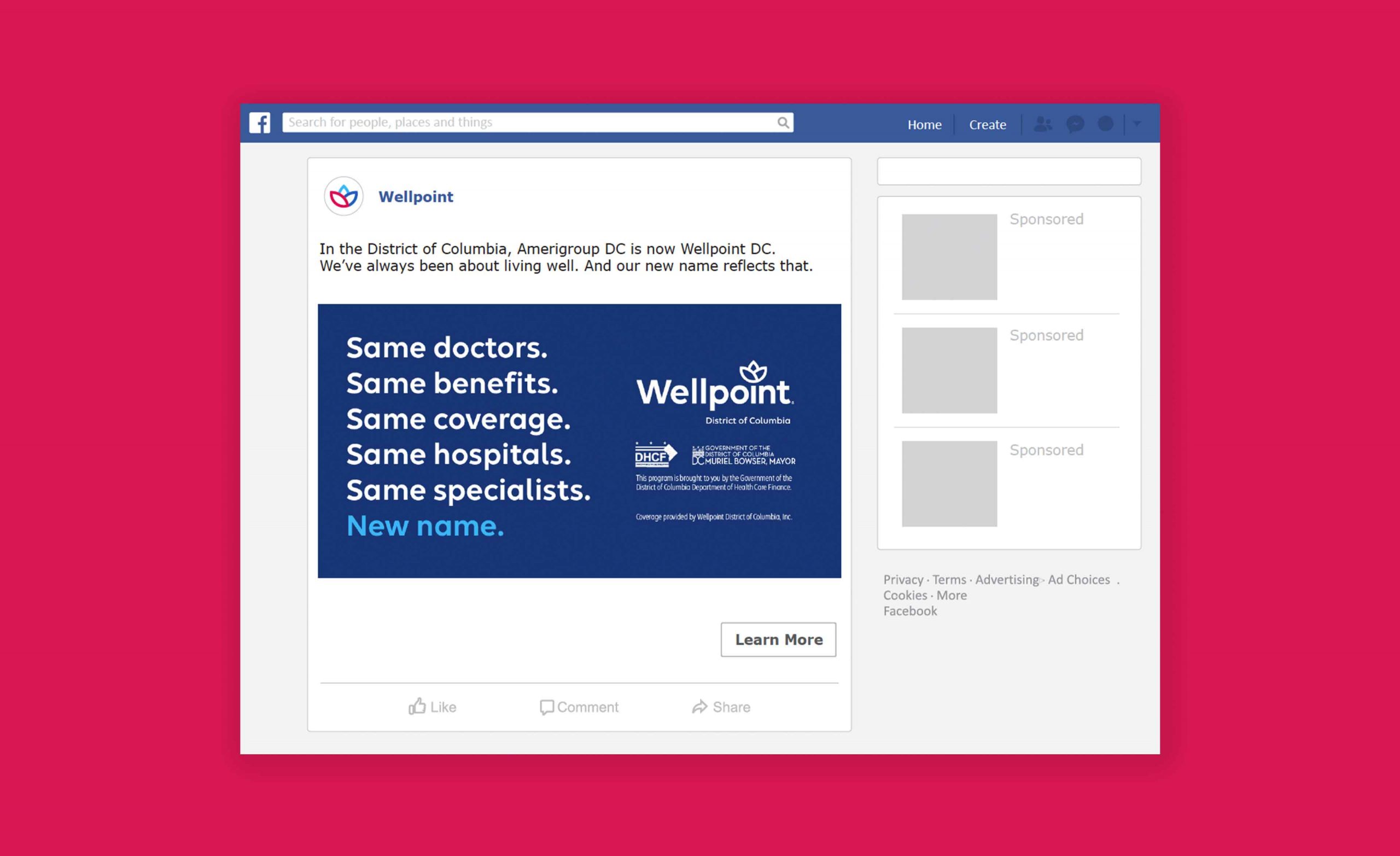
Medicaid Member-Facing Materials
After the brand launched publicly, we focused on deepening trust with members. I designed brochures, flyers, mailers, and in-office posters tailored to Medicaid audiences using clean layouts, plain language, and relatable imagery. These pieces helped make complex healthcare information more approachable and culturally relevant.
Impact-Oriented Results:
-
Helped streamline member onboarding during the Wellpoint rebrand by designing clear, accessible materials that reduced confusion and supported self-service—minimizing call center dependency.
-
Delivered multilingual print and digital assets that met Medicaid literacy standards and passed legal and compliance review with minimal revisions—accelerating production timelines.
-
Supported engagement across diverse populations by ensuring all materials reflected the tone, culture, and realities of the Medicaid audience.
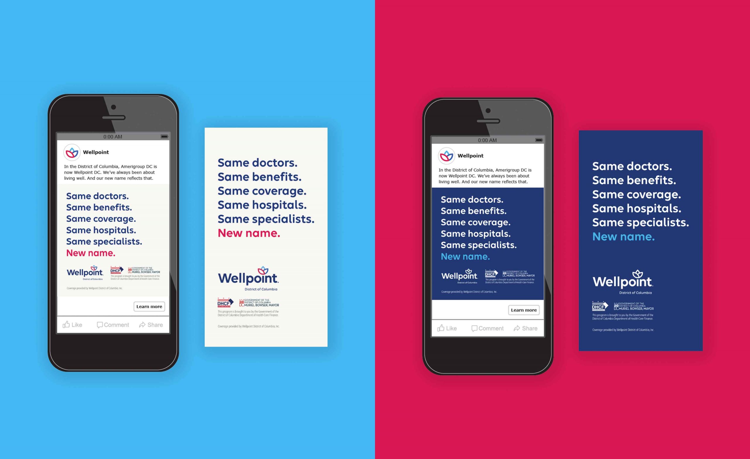
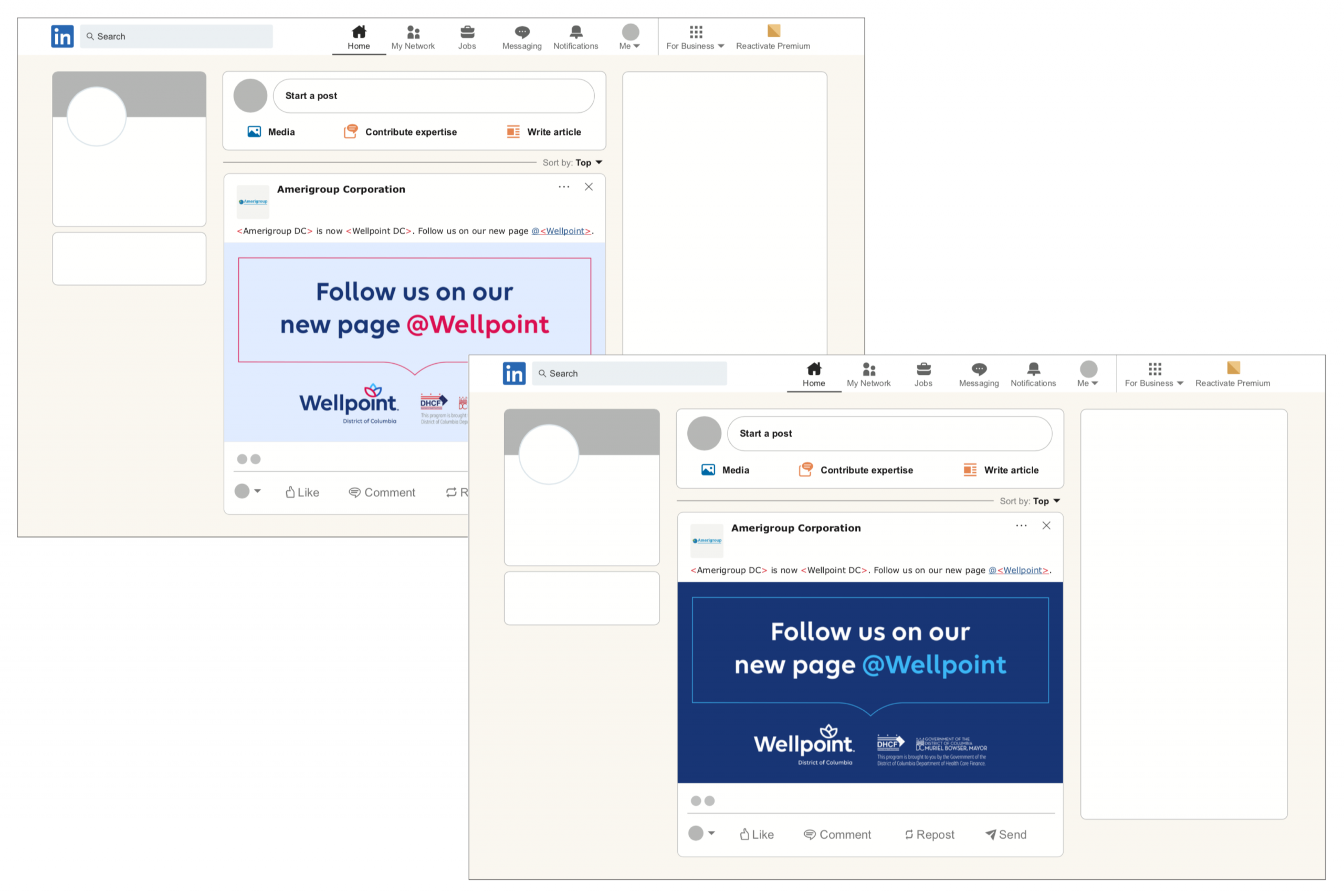
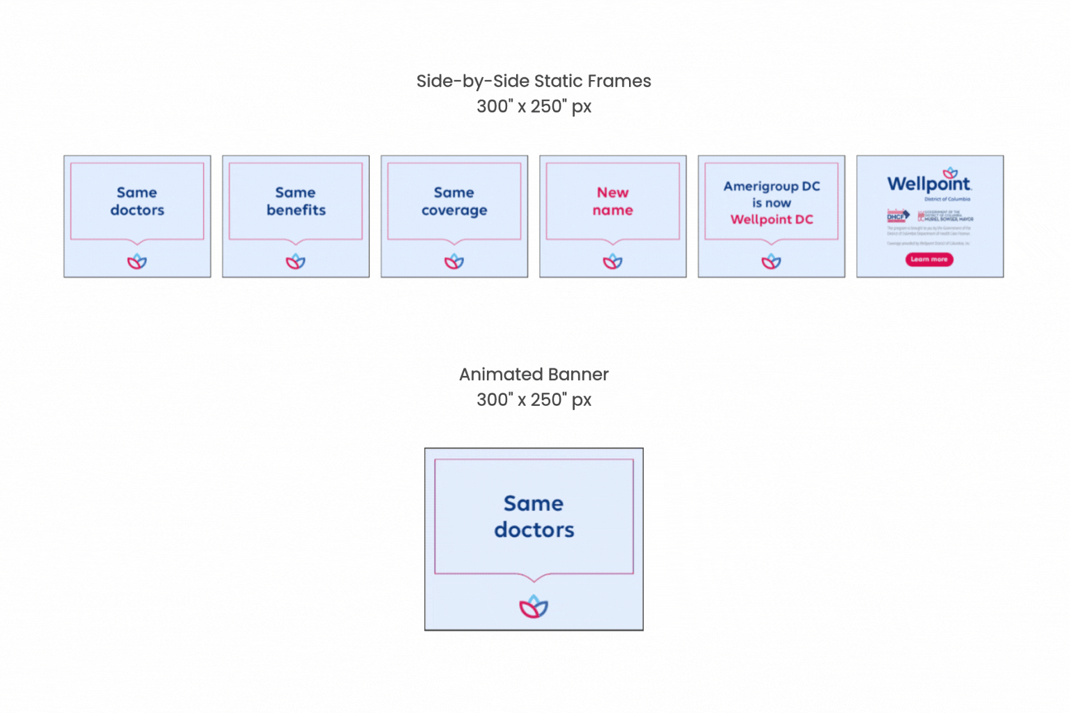
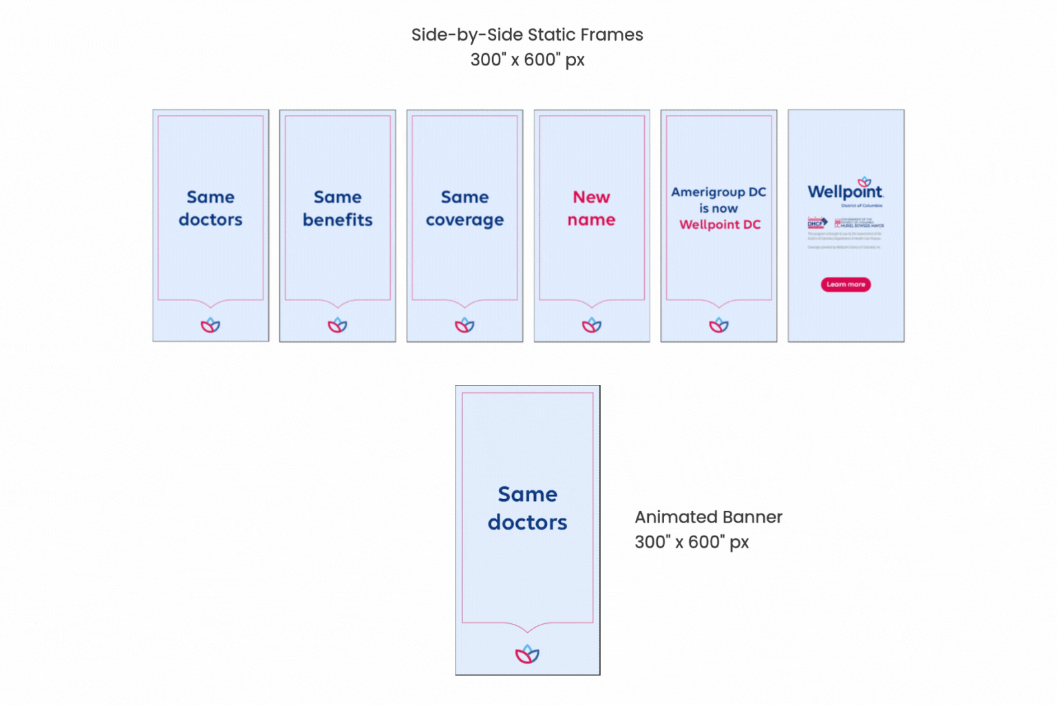
Social & Digital Campaign Assets
To expand visibility and engagement, I extended the Wellpoint identity into digital platforms. I created social graphics, web banners, presentations and email templates that reflected the refreshed brand while meeting the content needs of Medicaid members online.
Impact-Oriented Results:
-
Improved member onboarding during the Wellpoint transition by designing clear, accessible materials that answered common questions and reduced reliance on support channels.
-
Developed multilingual assets that adhered to Medicaid literacy standards and passed legal and compliance review with minimal revisions—accelerating delivery and increasing production efficiency.
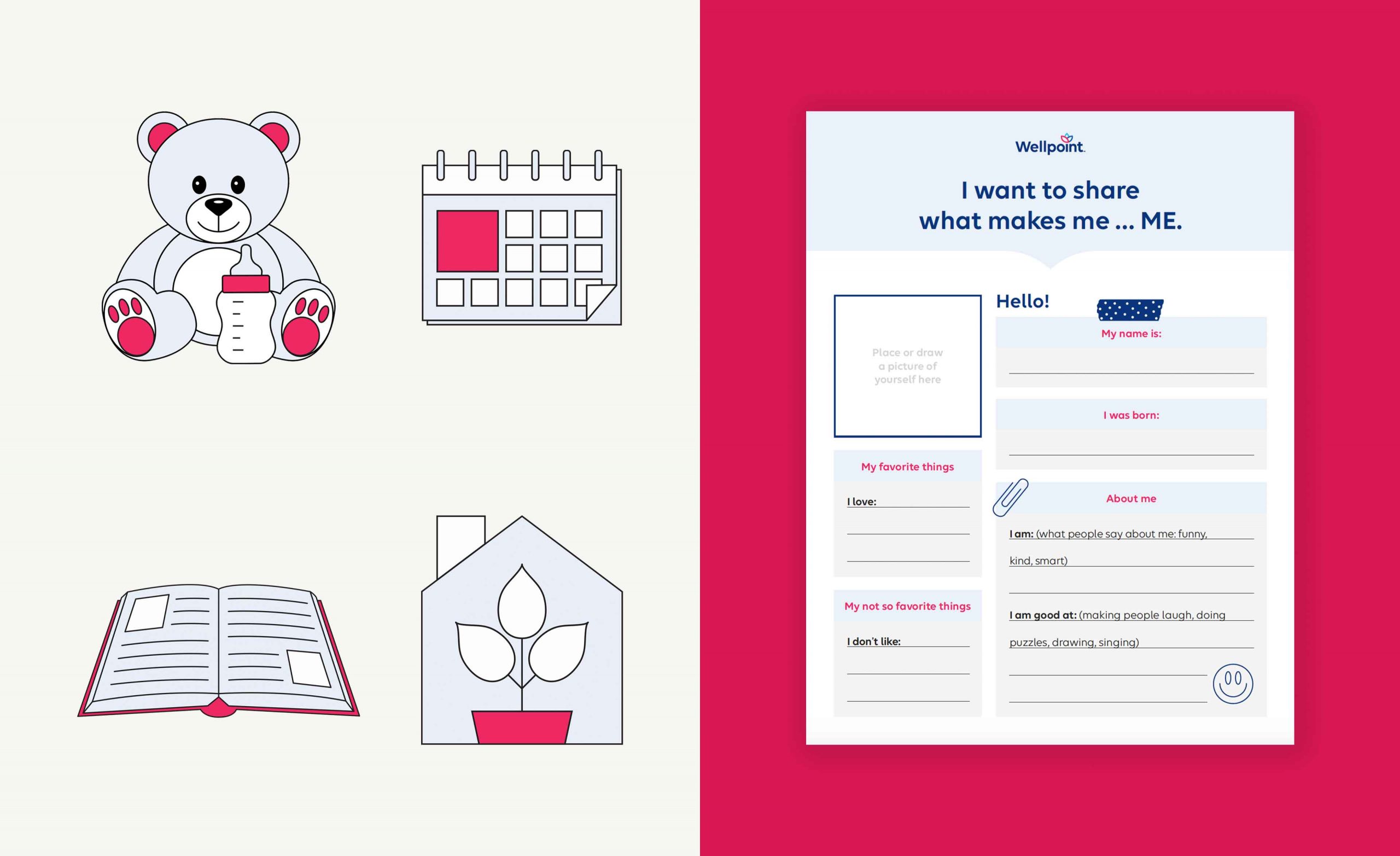
Iconography & Illustration System
To support visual consistency across the Wellpoint brand, I developed a custom icon and illustration system tailored specifically for Medicaid-facing communications. Each asset was thoughtfully designed to align with Wellpoint’s visual tone and style, helping simplify complex information while maintaining clarity, warmth, and cohesion across both print and digital materials.
Impact-Oriented Results:
-
Supported a smoother onboarding experience during the Wellpoint rebrand by delivering clear, member-focused materials that reduced confusion and helped lower call center traffic.
-
Produced multilingual print and digital assets that met Medicaid literacy requirements and passed legal and compliance review with minimal revisions—ensuring timely rollout across markets.
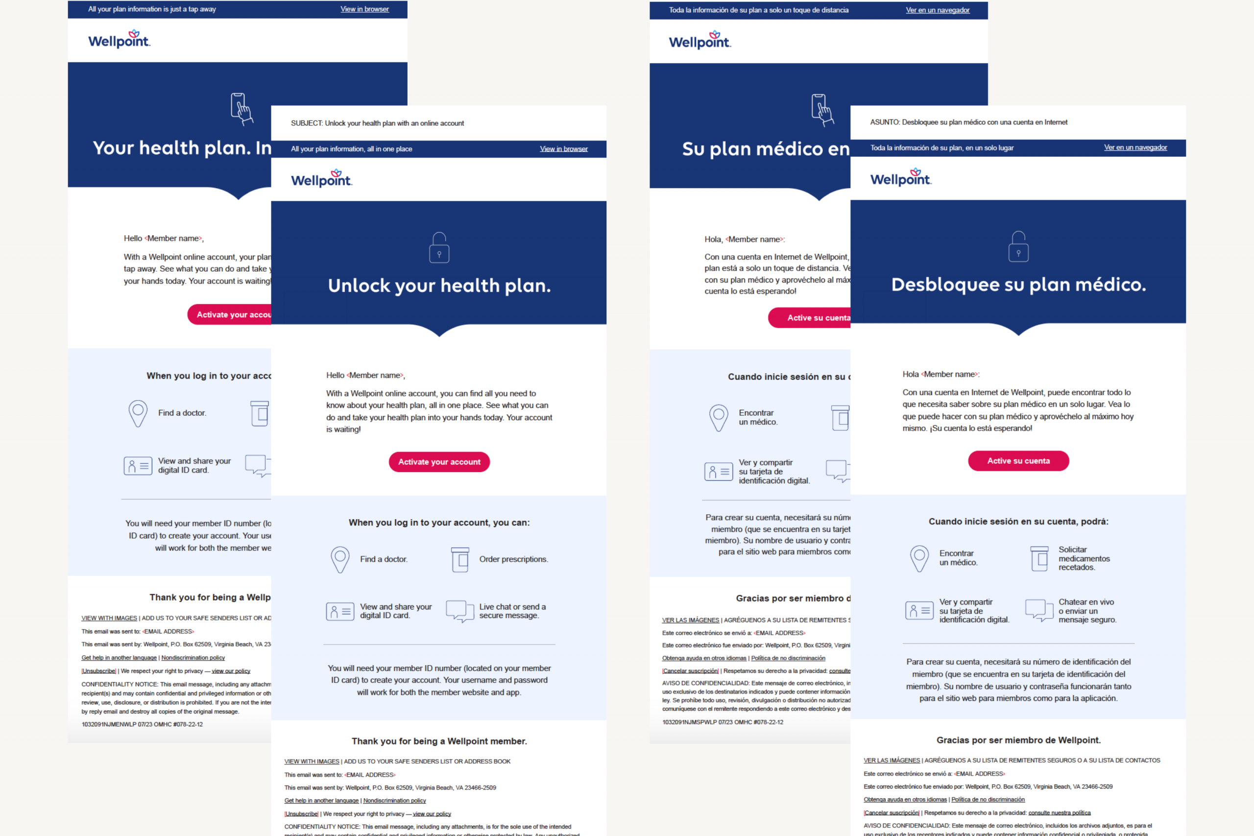
Email or Internal Comms Templates
To support the internal rollout of the Wellpoint brand, I designed a suite of branded email and document templates that helped teams communicate clearly, consistently, and professionally across departments and regional markets.
Impact-Oriented Results:
-
Helped streamline Medicaid member onboarding during the Wellpoint rebrand by creating clear, accessible materials that addressed common questions and reduced support inquiries.
-
Delivered multilingual print and digital assets that met Medicaid literacy guidelines and consistently passed compliance and legal review with minimal revisions—enabling faster, more efficient deployment across regional teams.
What I Learned
This project taught me how to navigate the complexities of a large-scale healthcare rebrand while designing with empathy for vulnerable audiences. I deepened my ability to balance creative vision with legal, compliance, and accessibility requirements, and I learned how to scale design systems that preserve brand consistency across hundreds of touchpoints. Most importantly, it reinforced the value of clear, human-centered communication in helping people feel supported through change.