Project
Rebranding Anthem
Role
Senior Designer – Concept, Execution, Vendor Coordination
Tools
Adobe InDesign
Adobe Illustrator
Adobe Photoshop
Adobe Animate
Timeline
2022 – 2025

Designing for Understanding
This project required designing information experiences that helped Medicaid members navigate a complex healthcare transition. Success depended on creating clear content hierarchy, intuitive communication systems, and audience-centered storytelling across multiple channels.
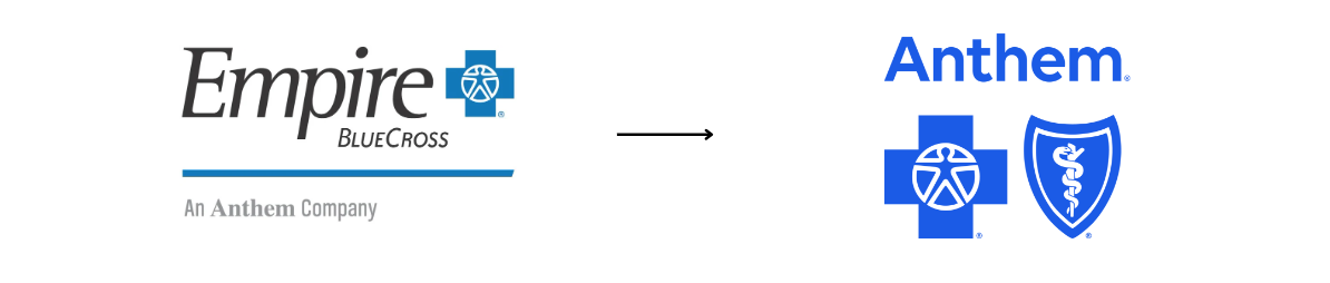
The Challenge
As Empire rebranded to Anthem, our team was tasked with creating Medicaid-specific communications that reflected the new visual identity, while remaining approachable, respectful, and relevant to low-income individuals and families. This required a deep level of design sensitivity, not just in layout and messaging, but in the emotional tone of the visuals themselves.
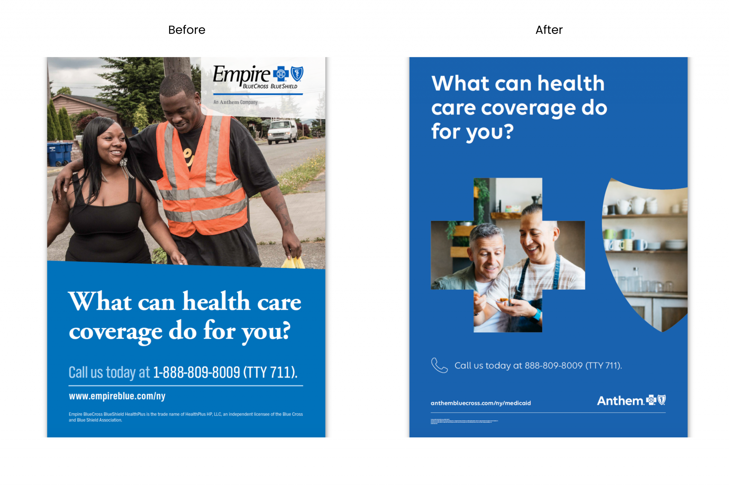
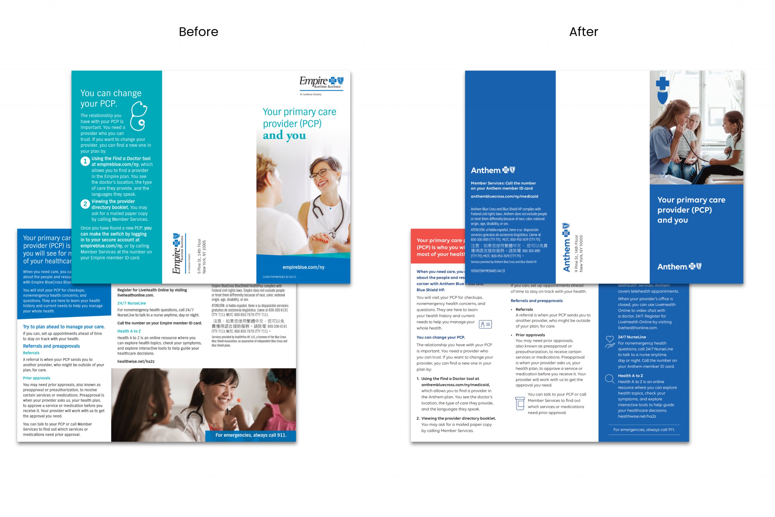
As the lead designer, I curated stock photography that authentically reflected the lived experiences of our members. Any imagery suggesting luxury, such as upscale fashion, designer kitchens, or visible tech, was intentionally avoided to maintain trust and relatability.
My Role
As the lead designer, I translated Anthem’s refreshed brand identity into real-world applications, ranging from member-facing brochures and direct mail to social content and environmental signage.
The Process
Through a series of collaborative working sessions with creative directors, writers, strategists, and project managers, I joined detailed kickoff calls to align on the creative brief, audience intent, and project goals. This upfront clarity allowed me to design with both empathy and strategy, tailoring each piece to meet brand standards and member needs.
Over the course of three years, I worked cross-functionally across departments to deliver a cohesive rollout of more than 50 branded assets. I developed flexible layout systems and scalable design templates that helped regional teams adopt the new Anthem identity quickly, confidently, and consistently.
The Solution
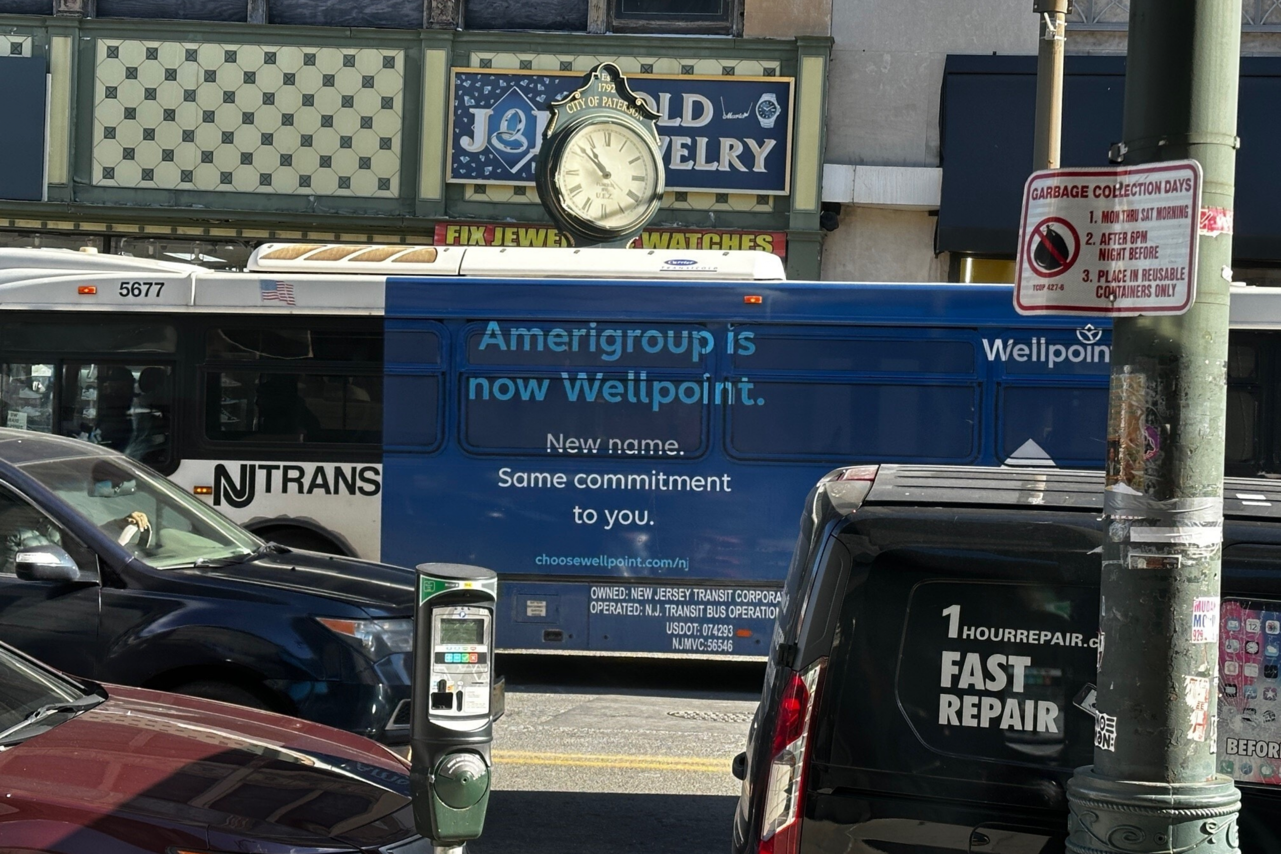
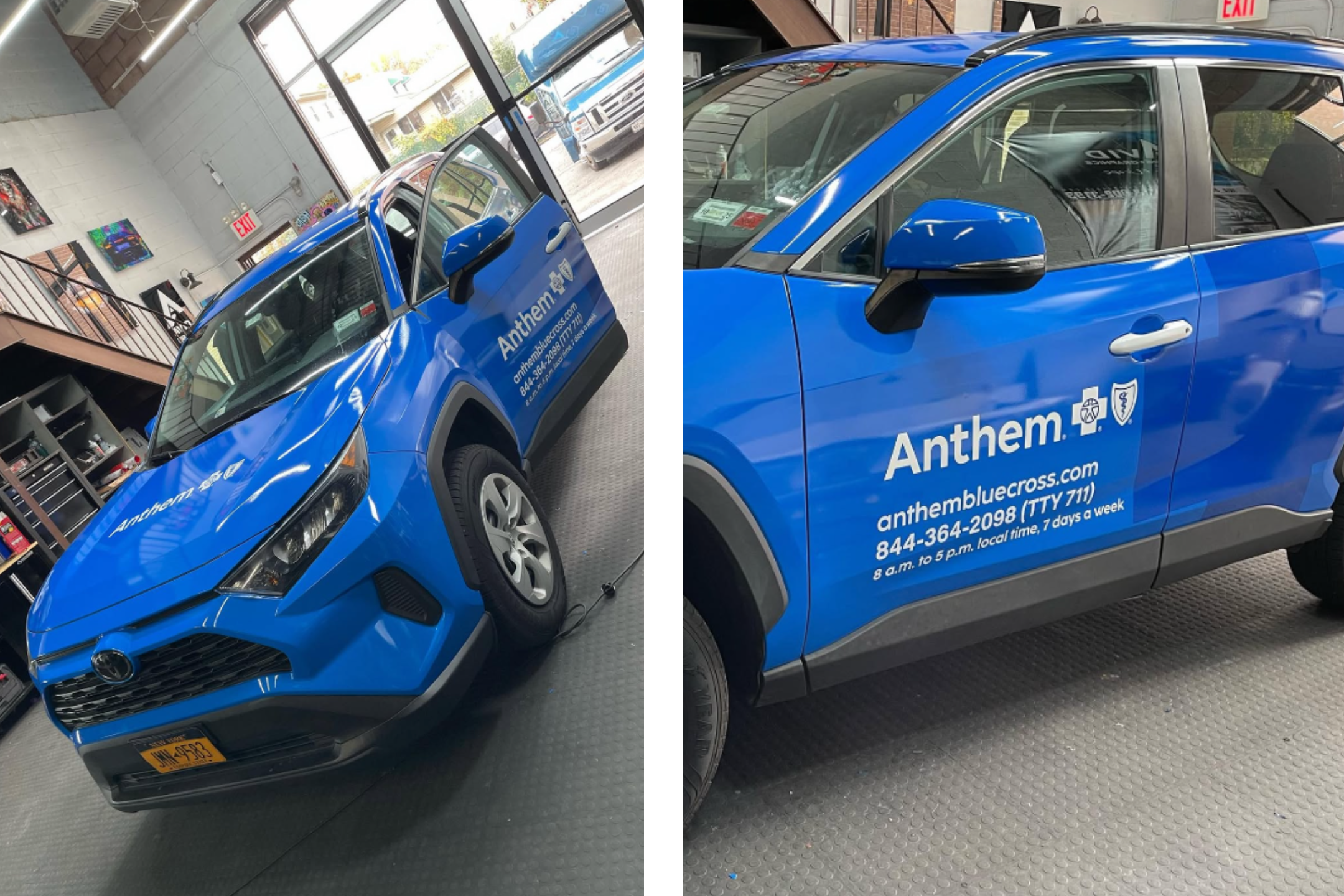
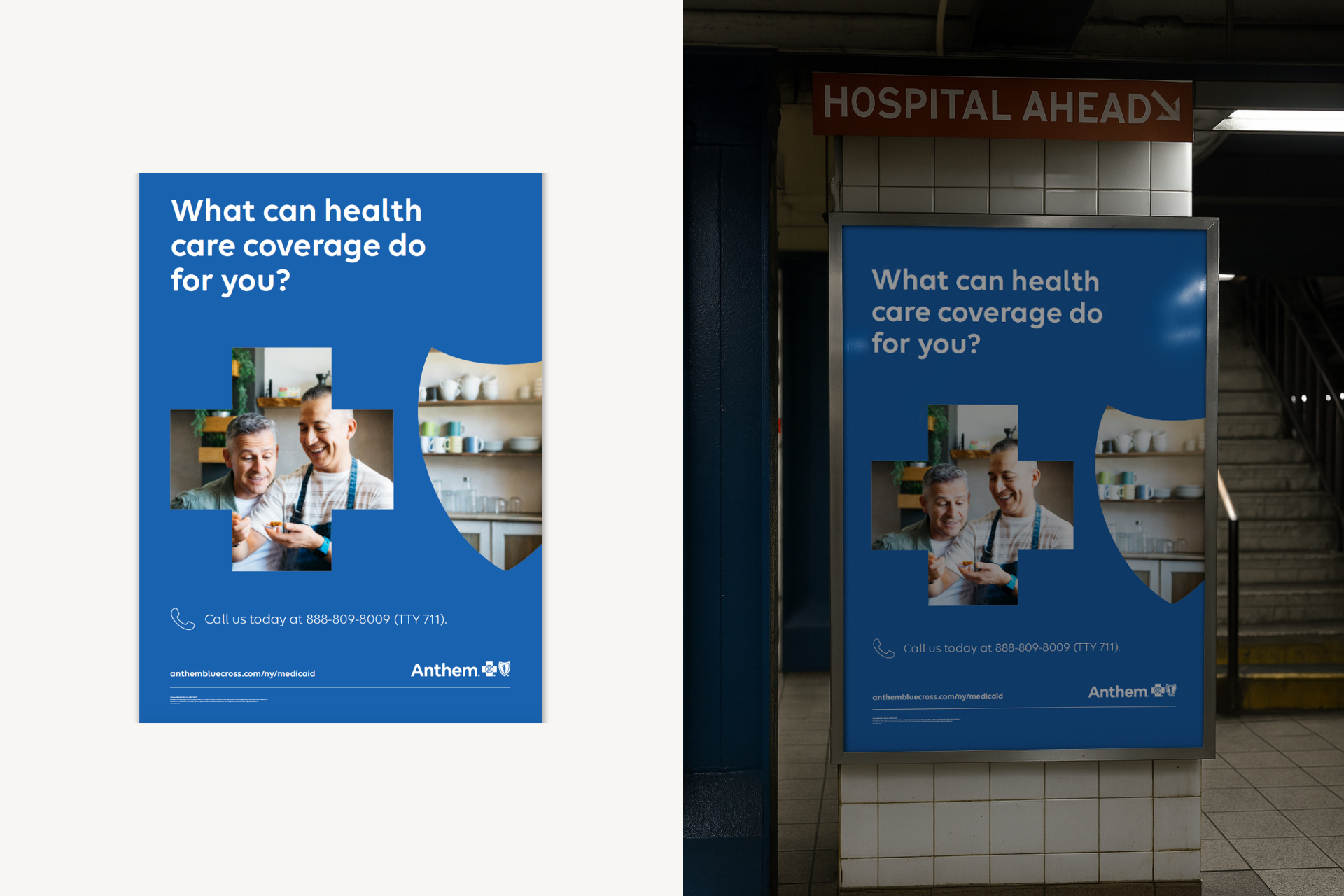
To support Anthem’s public brand rollout, I led the creative for high-visibility transit wraps aimed at boosting awareness in urban markets, including New York City. These designs served as bold, real-world expressions of the rebrand: attention-grabbing, accessible, and unmistakably Anthem.
Working within strict brand and compliance guidelines, I crafted a layout that prioritized simplicity, legibility, and scale to ensure clarity even when the vehicles were in motion. The color palette, typography, and visual elements were thoughtfully chosen to translate seamlessly across different vehicle types and environments.
The final wraps functioned as rolling billboards, embedding the Anthem brand into the heart of the community. A supporting video captured the wrapping process in action, reinforcing the reach and relevance of the campaign.
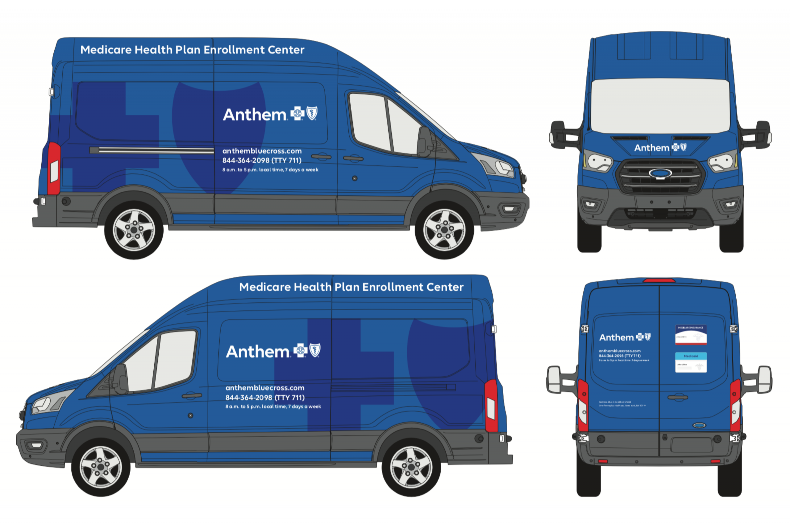
Real-World Results:
-
Increased brand visibility during Anthem’s public-facing rebrand
-
Designed for scale, clarity, and movement
-
Seen daily by thousands of pedestrians and drivers in key urban centers
Medicaid Member-Facing Materials
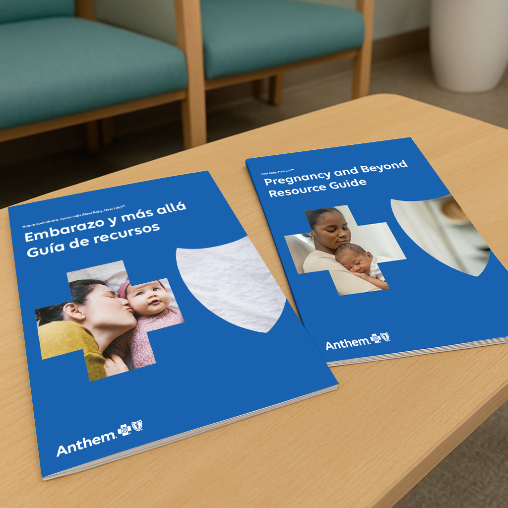
After establishing public visibility, the next step was reinforcing the brand within the community. I designed brochures, mailers, posters, and in-office materials that made the new identity feel familiar, approachable, and supportive to Medicaid members.


Impact-Oriented Results:
-
Supported smoother onboarding during the rebrand with materials tailored to address member questions and reduce call center volume.
-
Created multilingual print and digital assets that aligned with Medicaid literacy standards and passed legal and compliance review with minimal edits
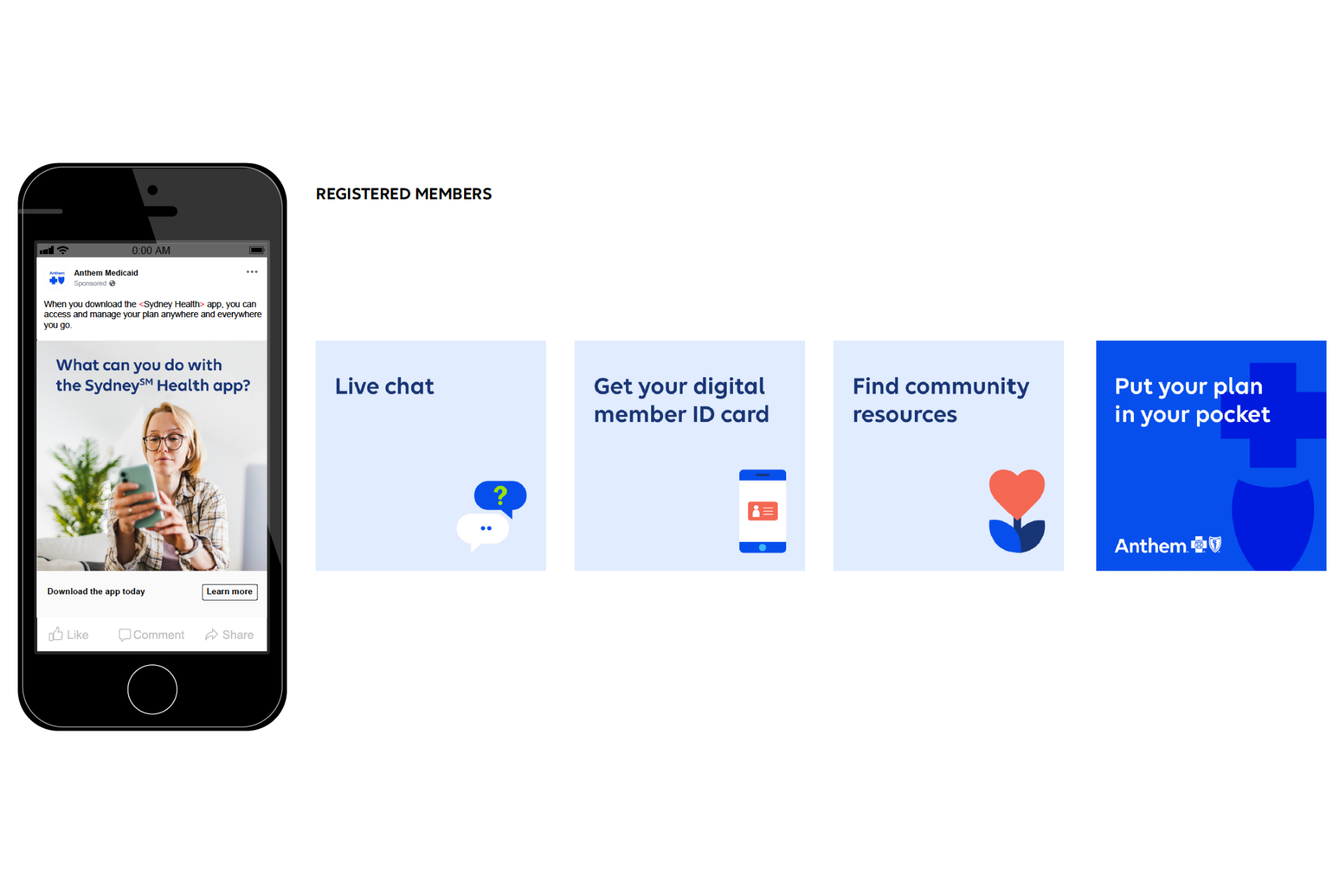
Social & Digital Campaign Assets
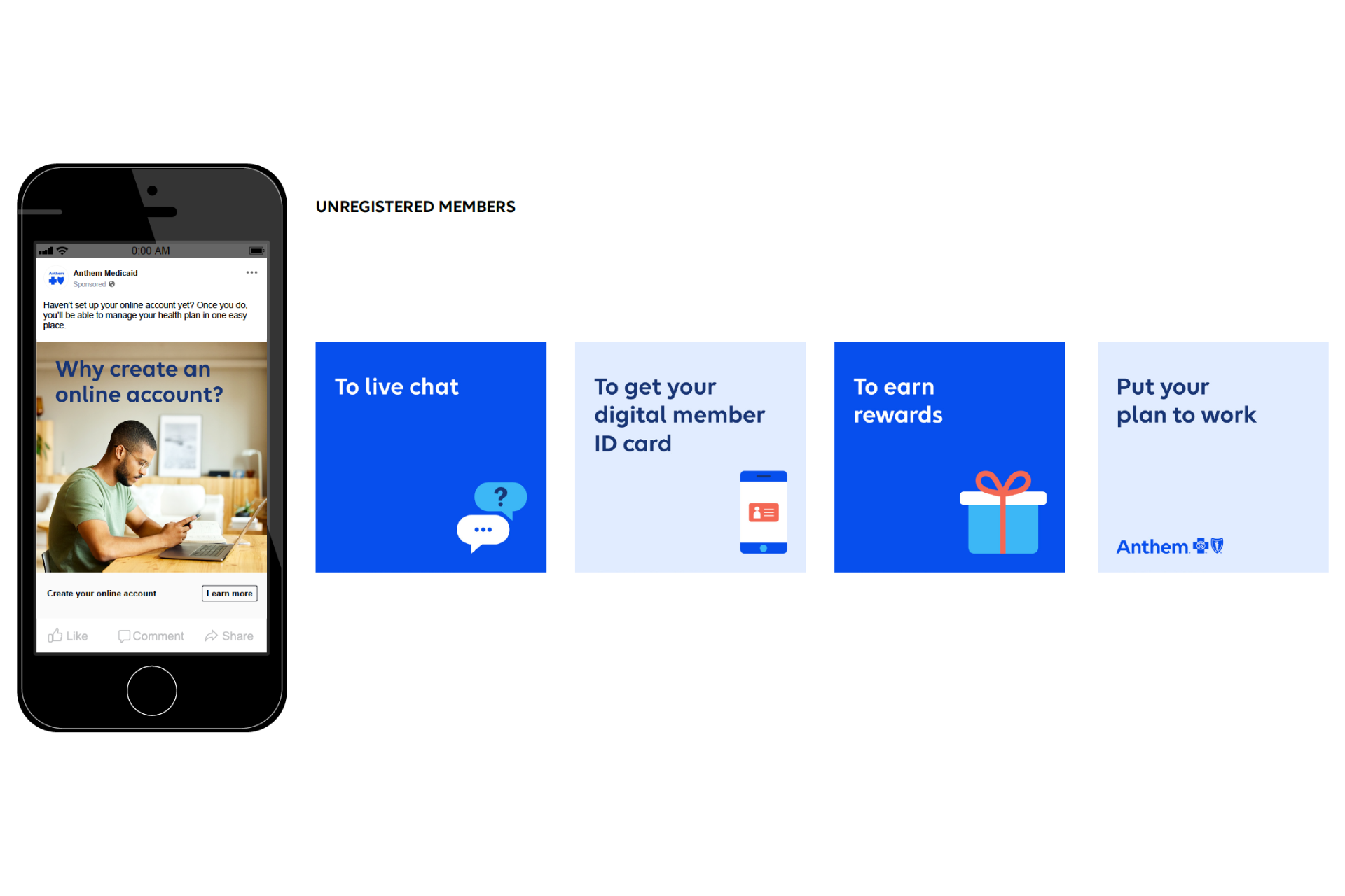
I extended the campaign across digital channels by designing social media graphics, web banners, and promotional assets that helped drive awareness and engagement online.
Impact-Oriented Results:
-
Supported smoother onboarding during the rebrand with materials tailored to address member questions and reduce call center volume.
-
Created multilingual print and digital assets that aligned with Medicaid literacy standards and passed legal and compliance review with minimal edits
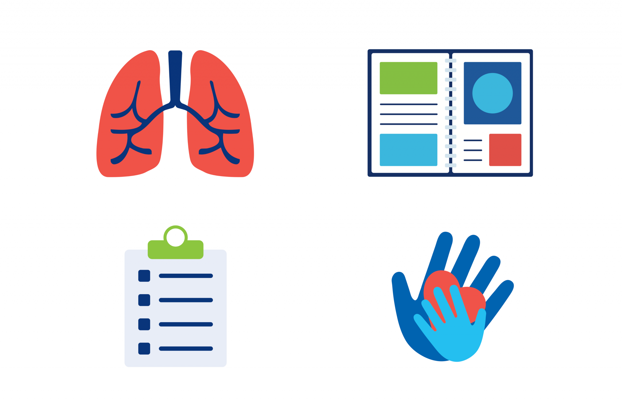
Iconography & Illustration System
To ensure visual consistency across the Anthem brand, I developed a custom library of illustrations and icons tailored to the needs of Medicaid communications. Each asset was designed to align with Anthem’s visual language while supporting clarity, accessibility, and audience relevance.

Impact-Oriented Results:
-
Supported smoother onboarding during the rebrand with materials tailored to address member questions and reduce call center volume.
-
Created multilingual print and digital assets that aligned with Medicaid literacy standards and passed legal and compliance review with minimal edits
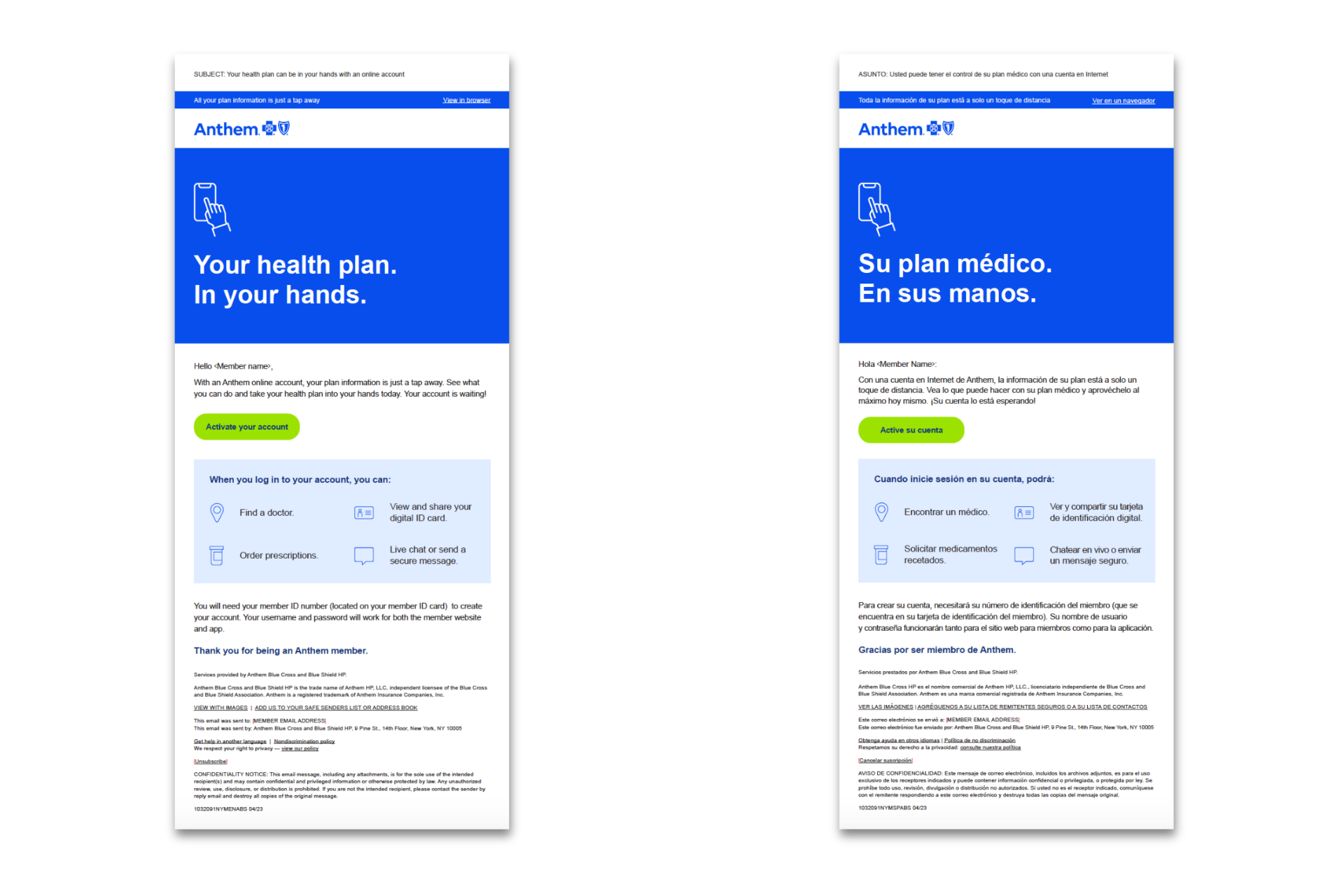
Email or Internal Comms Templates
To support the internal rollout and day-to-day communications, I created branded email and document templates that helped teams stay consistent, clear, and aligned across departments.

Impact-Oriented Results:
-
Supported smoother onboarding during the rebrand with materials tailored to address member questions and reduce call center volume.
-
Created multilingual print and digital assets that aligned with Medicaid literacy standards and passed legal and compliance review with minimal edits
What I Learned
The Anthem rebrand gave me hands-on experience in translating a large-scale national identity shift into clear, localized design. I learned how to work within strict brand and compliance guidelines while still creating materials that felt approachable, trustworthy, and human for Medicaid members. This project strengthened my ability to manage high-volume creative under tight deadlines and showed me how thoughtful design can foster clarity, confidence, and connection during moments of change.