Project
Facebook Facelift
Role
User Research
User Interviews
Sketching
Wireframing
Prototyping
Visual Design
Interaction Design
User Testing
Tools
Figma
Adobe Photoshop
Adobe Illustrator
Timeline
6 Weeks (2022)
Facebook Redesign
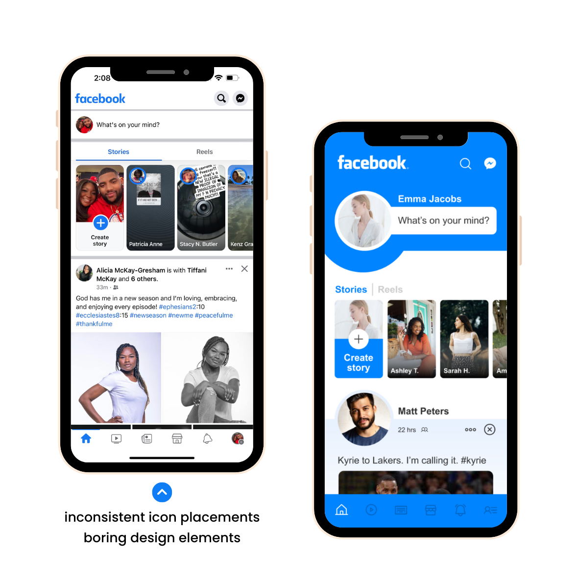
I’m no longer impressed with the Facebook app. Its design is a bit stale and boring, “meh”, frankly. Here is my attempt to give it a facelift to make it more beautiful, yet simple looking and easy to use.
The challenge
From the start of this project, there were clear signs of lack of consistent branding across Facebook’s platform. This includes both the general color scheme and logo visibility. Having a strong brand presence is important when developing an app. This motivated me to explore ways to increase its overall brand presence within the app.
The solution
Transform the look, feel and user experience of your social media app while keeping functionality in place.
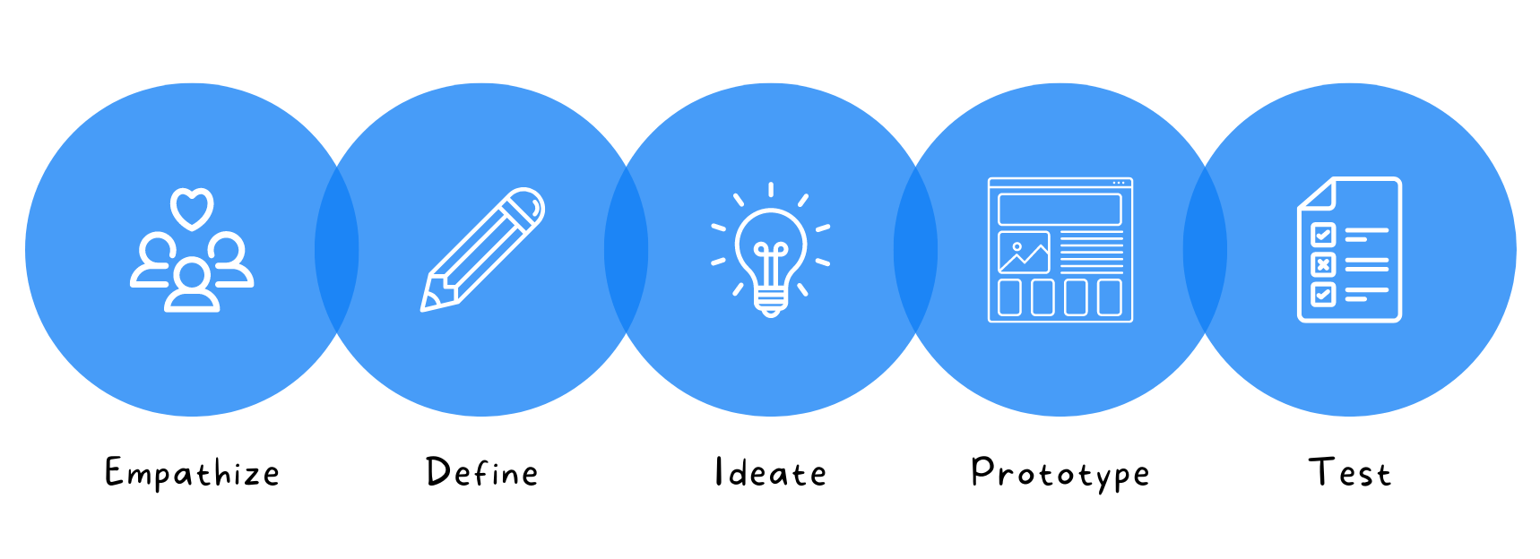
The Research Process: Design thinking
It was important in this stage to define clearly, the challenges ahead, the potential users, and what we wanted to accomplish with the design. To narrow down the best solutions and deliver a creative and simple solution to this problem, I used Design Thinking; a process based on user-centered solutions that are divided into 5 steps: empathize, define, ideate, prototype, and test.
Empathize: User research
To improve the overall experience for these existing users, I conducted a user survey to uncover pain points that current users were experiencing while using the app. Here are some of the questions I asked in the survey:
- Do you use Facebook? If so, why?
- Are there any challenges you face while using the app?
- If you could change one thing about the app, what would that be?
- Do you use any other social media apps? If so, which ones?
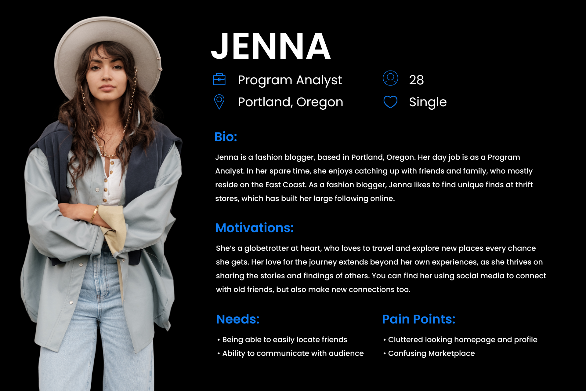
Define: Who's the user?
Based on my research and the feedback that I gathered from users, two distinct personas emerged based on their past experiences using Facebook. Our primary audience was those who look at social media as a way to stay in touch with family and friends.
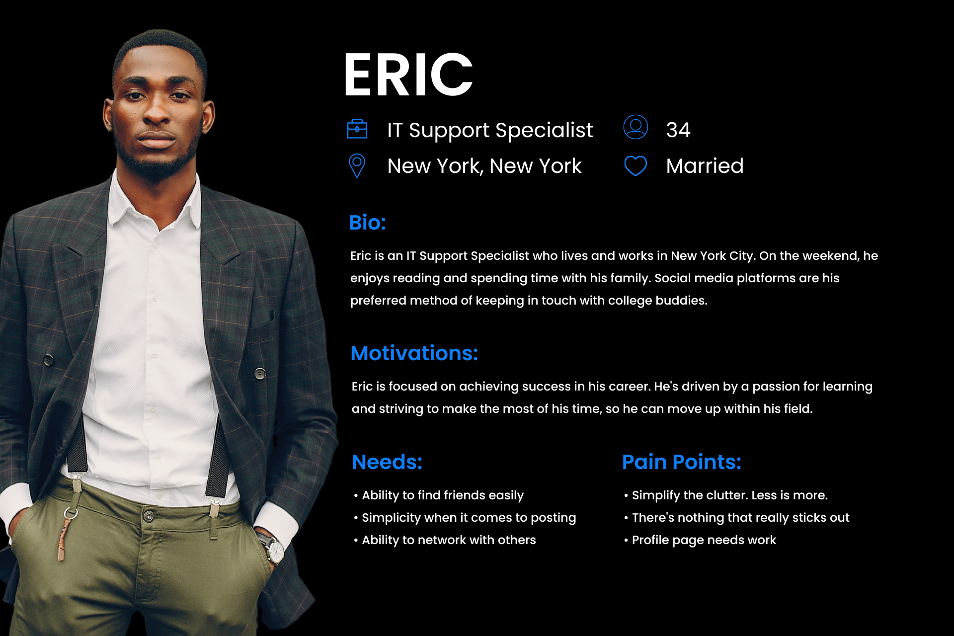
Define: User Insights
The biggest problem reported was that users don’t enjoy the app as much as they use to. Some users mentioned that several of their friends no longer post on the app, so they stopped using it as well. Most users who abandoned the app, have decided to spend their time on other social apps, like TikTok, Instagram, YouTube, or Snapchat.
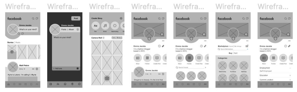
Ideate: Lo-fi Wireframes
After a few initial sketches, I created some low-fidelity wireframes to kickstart the visual design of the application and get some initial feedback on its usability.
I used lo-fi wireframes to test with some of the users I engaged with throughout the process and discovered what worked and didn’t work when it came to functionality, flow, and design.
Cons:
- “What happens when I type more text than the space allows when creating a post?”
Pros:
- “Everything is straightforward and accessible, which makes it much simpler to use. The profile images are larger, making the user experience more appealing.”
- “I really like how clean it looks.”
Design Iteration
After doing some user testing with the wireframes, and gathering feedback, I made some adjustments to the design to be more streamlined and user-friendly. These adjustments included:
- Add a scroll bar to create a post-pop-up as soon as you click to start typing.
Below are the Low Fidelity Wireframe screens after testing and iteration.
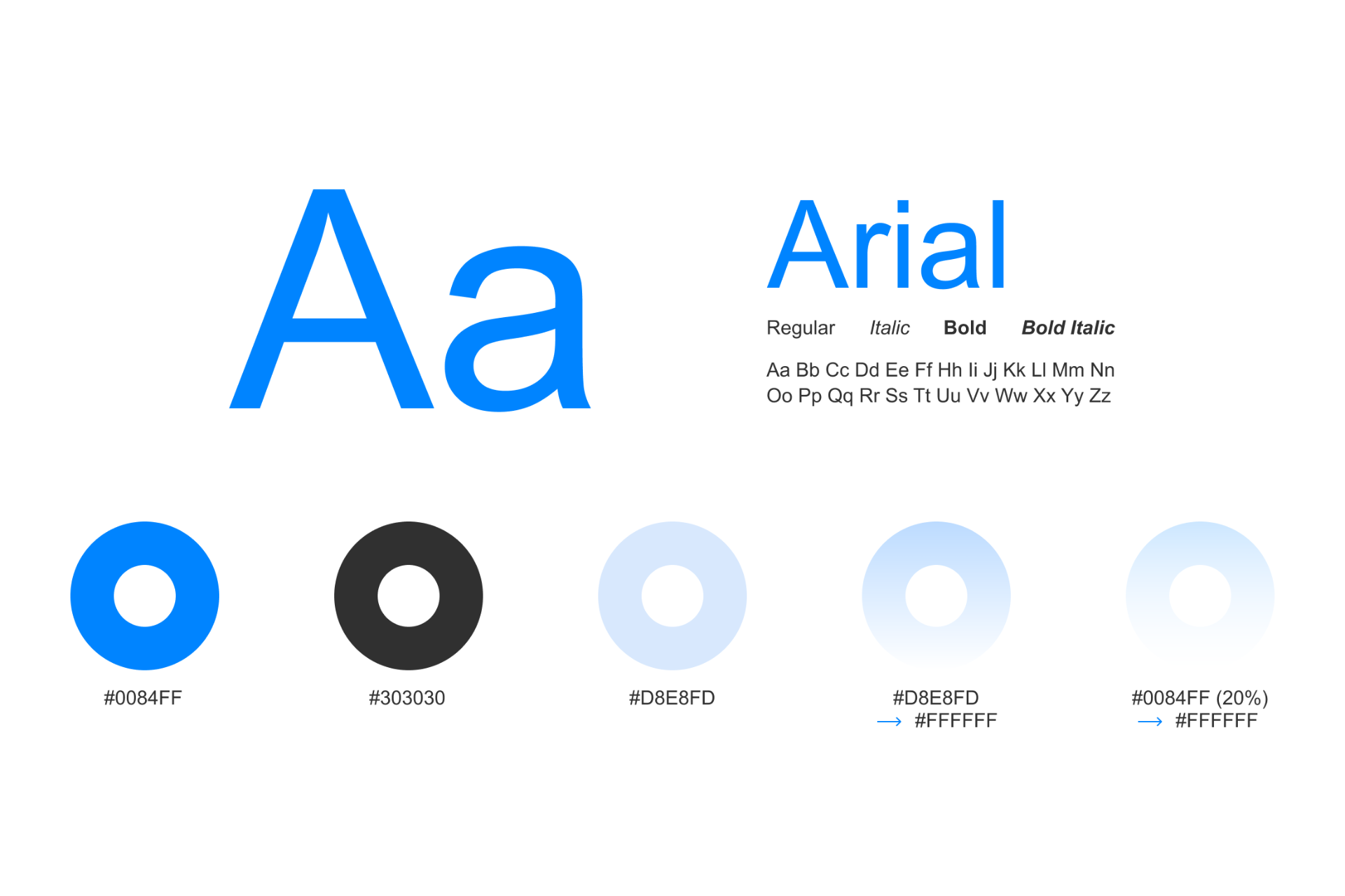
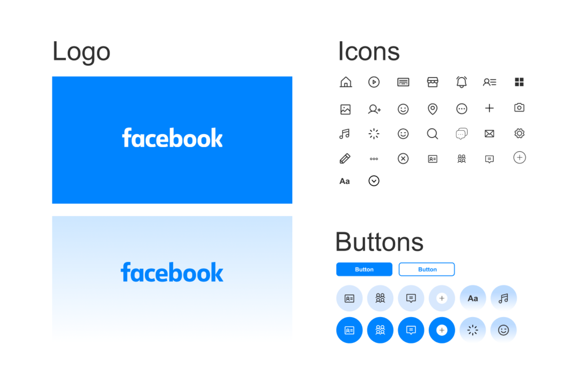
Ideate: Typography & Design System
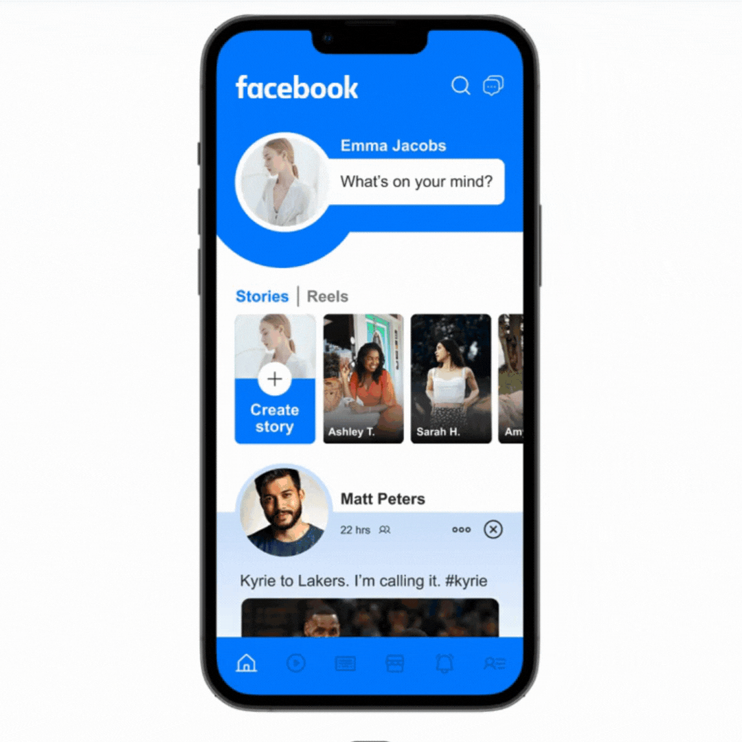
Prototype: Facebook Homepage
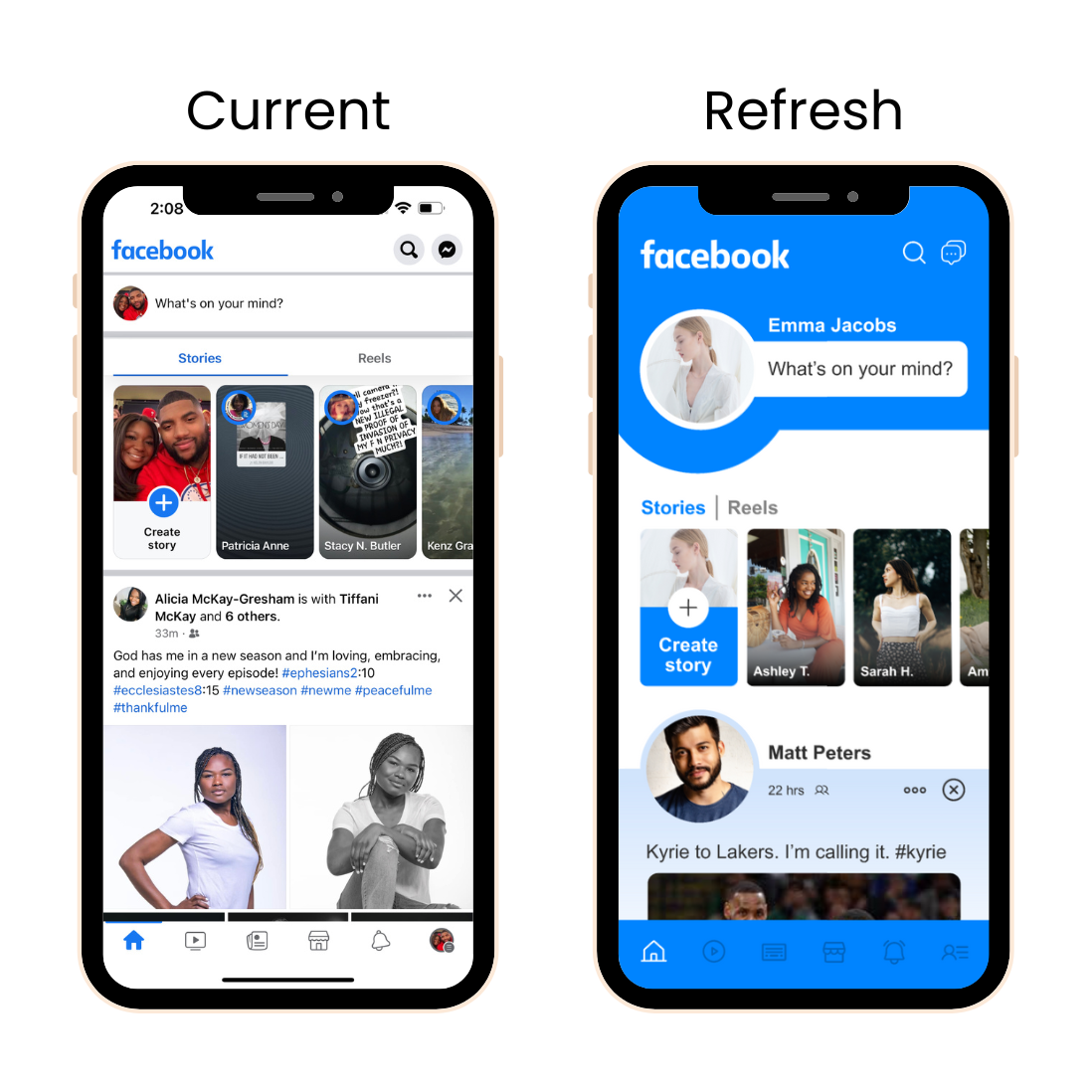
Though I don’t want to overcomplicate Facebook’s design, I feel like it would be nice to make the profile photos of your friends and family more prominent so that they aren’t lost on the page.
In Facebook stories, I updated the names to include a first name, and last initial so that it doesn’t look too cluttered. Finally, I added some more blue since that is Facebook’s brand color!
Prototype: Create Post
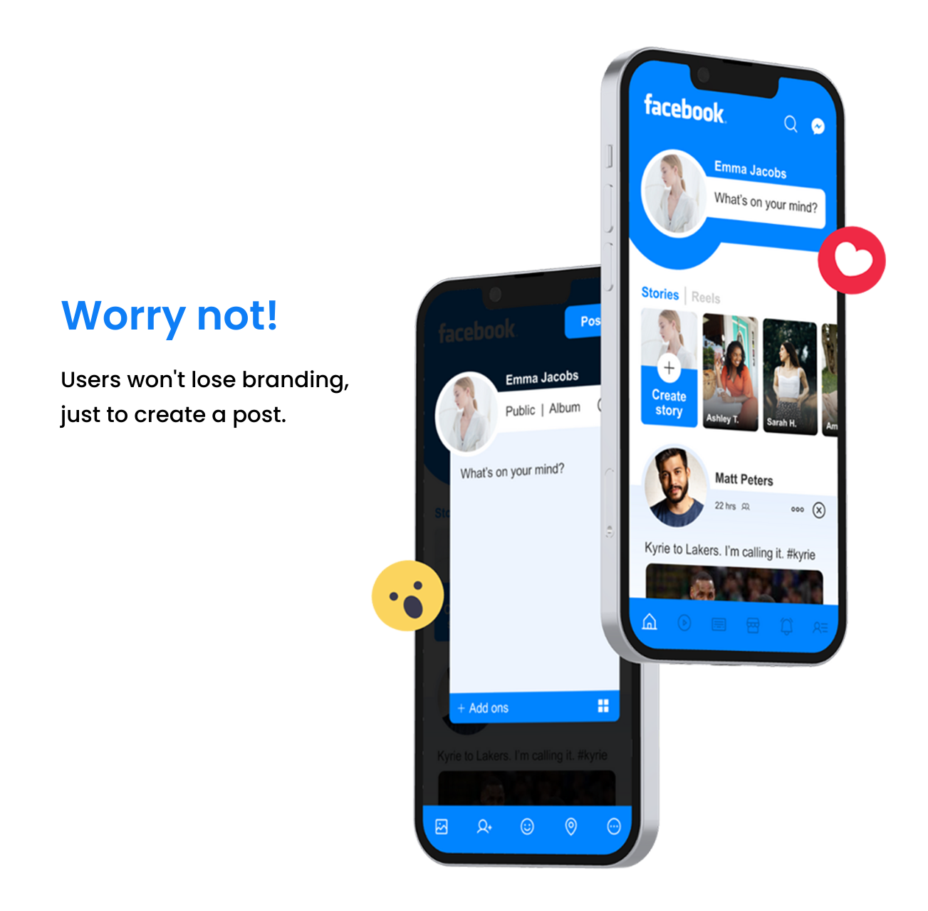
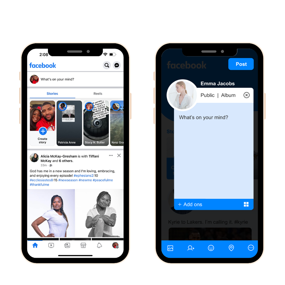
I noticed that your users were not being presented with the best possible user experience. Whenever a user clicks the “create story” button, I noticed that the brand colors are lost. I believe a simple solution for this would be to add their brand color, verse having so many gradients running along the top of the screen.
Also, I noticed that Facebook typically places its close/exit button (x) on the top right. However, in the “create story” section they decided to switch it to the left side. This hurts the user’s experience, so, I switched it back over so that it looks more coherent with the rest of your app.
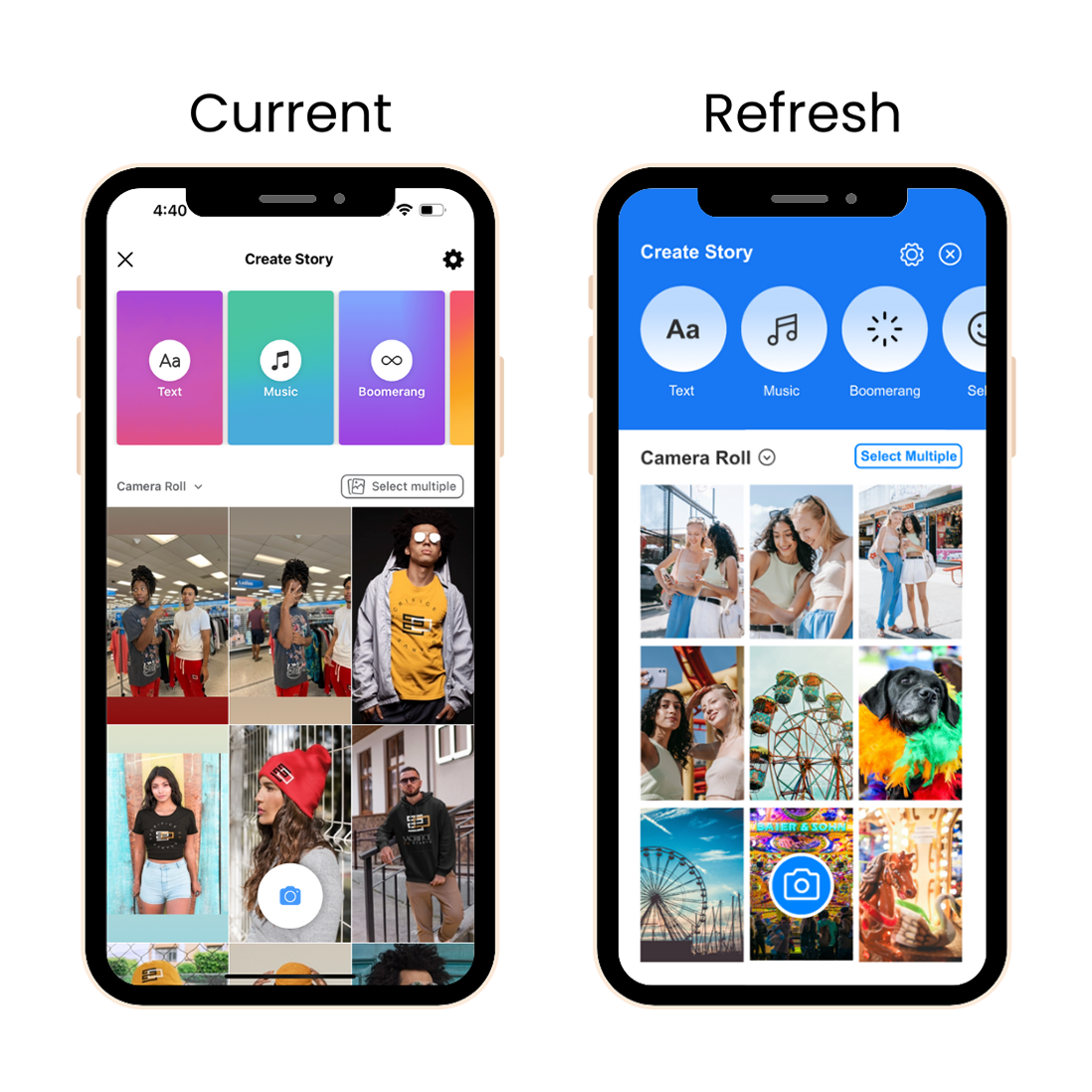
Prototype: Create Story
I noticed that your users were not being presented with the best possible user experience. Whenever a user clicks the “create story” button, I noticed that the brand colors are lost. I believe a simple solution for this would be to add their brand color, verse having so many gradients running along the top of the screen.
Also, I noticed that Facebook typically places their close/exit button (x) on the top right. However, in the “create story” section they decided to switch it to the left side. This hurts the user’s experience, so, I switched it back over so that it looks more coherent with the rest of your app.
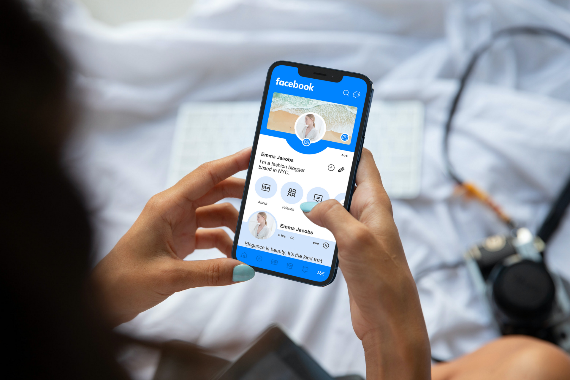
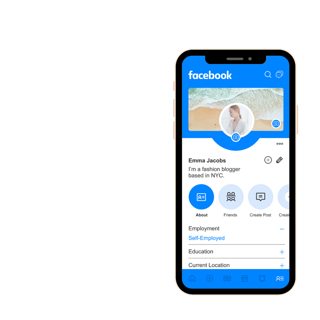
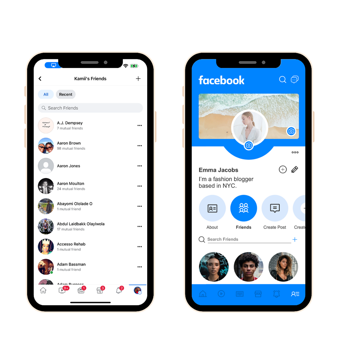
Prototype: Profile
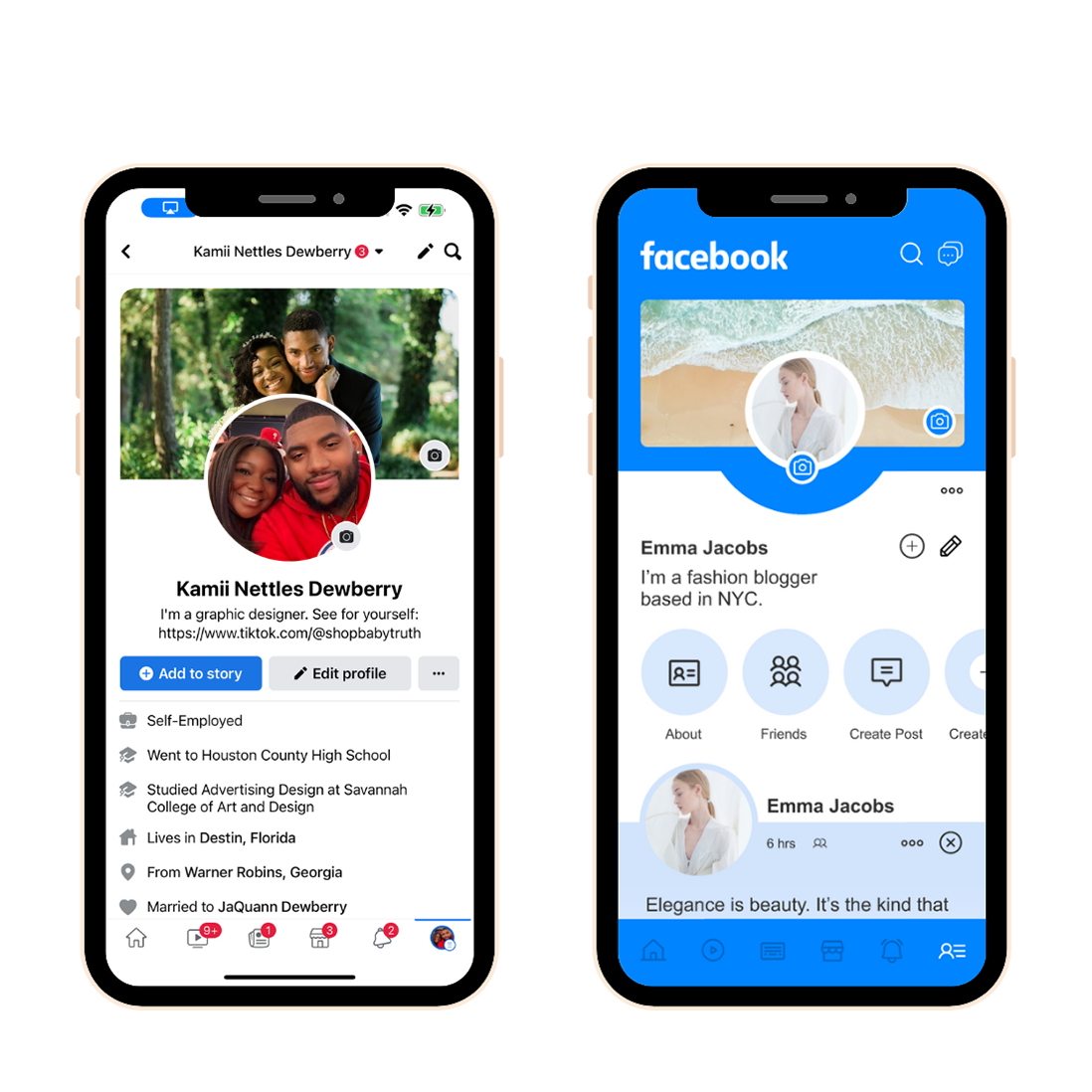
The original profile page is overwhelming and hard on the eyes. Less is more when it comes to design, and the current Facebook page has way too much going on. So, my approach to solving this issue is to organize every feature behind a circular button. This way, it’s clean and still easy to find what you love most about your profile page.
The about section on Facebook is a lot of information, so I think delivering the same information using a responsive accordion dropdown will work wonders. It is important to conserve user attention and deliver only the most essential information in this area so that they get the necessary information quickly and efficiently.
As a Facebook user, it can be difficult to understand why you should leave your profile page, just to view all of your friends on a long list. We could feature a scrollable 3-column list that includes both their name and how many friends you have in common.
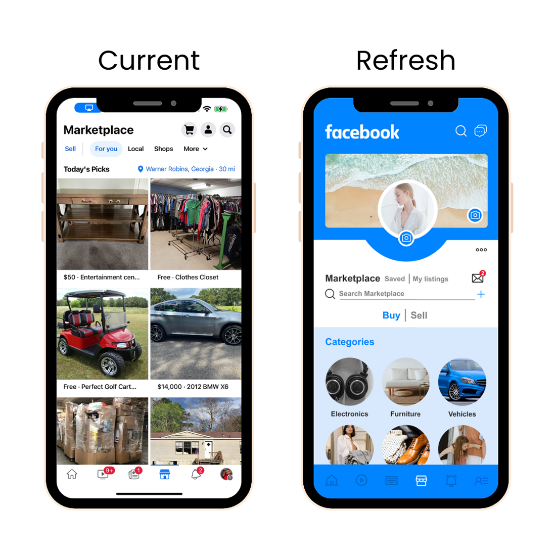
Prototype: Marketplace
The marketplace has to be one of the most inconvenienced shopping experiences. An easy way to clean up this page is by listing items under categories. I believe having the option to toggle back and forth between Buy or Sell is a great feature to have along with access to your messages about inquiries.
Feel free to test out my Figma prototype below.
Prototype: Design & User Flow
The final design was modern, sleek, and eye-catching. I wanted to enhance photos and bring out the brand’s colors in a minimalistic and clean way. My goal was to create a world-class experience, so I didn’t see any issues with the flow of creating a post or story. So, no need to fix what’s not broken. See my prototype in action below.
Test: Testing it with users
For the final test, I used a high-fidelity clickable prototype of the app and asked them to use it to complete a couple of task-based scenarios:
- Click to create a story.
- Click to create a post.
- Find your friends under your profile page.
The general feedback I received was overwhelmingly positive. While it was not possible for me to observe my test users navigate the prototype, their final impressions were conclusive.
The app redesign is simple and straightforward, with a very familiar user experience. The test users were able to complete the task-based scenarios given to them, with ease and fluidity. They were impressed by the usability of this new product.
Closing Statements
The updated design for Facebook makes for a more dynamic and modern look, which will likely draw in new users. From a usability standpoint, I think the changes seem to address some shortfalls that have been pointed out previously in previous research.