Project
Proposal Project
Role
UI/UX Design
Tools
Figma
Miro
Timeline
7 Days (2024)
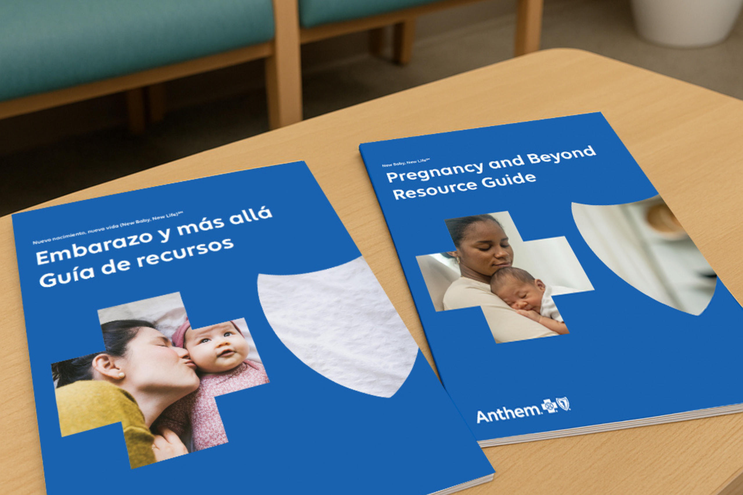
Anthem Blue Cross Blue Shield
Anthem Blue Cross Blue Shield is a leading health insurance provider in the United States, operating under the Anthem, Inc. umbrella, one of the largest health insurers in the country. During my time as a Senior Designer for Elevance Health, I undertook a proposal project aimed at creating an intuitive, secure, and stress-free experience to empower members in managing their health information and improving their healthcare journeys.
The Brand — Anthem Blue Cross Blue Shield is a leading health insurance provider in the US, offering medical, dental, vision, and prescription drug coverage across multiple states. They serve millions with access to healthcare providers, wellness programs, and cost management tools.
Project Background — While working at Elevance Health as a Senior Designer, I crafted an experience to propose to one of their largest insurance brands, Anthem Blue Cross Blue Shield.

Context
Overview — This project is a digital experience proposal for Elevance Health. It will be introduced to new members via email.
My Role — As the sole designer, I led the design of UI and UX, crafting layouts and prototypes to articulate the vision, design principles, and content strategy. These efforts facilitated idea conceptualization, alignment, and informed decision-making processes.
Timeline — During the 7 day timeline, I underwent two creative reviews with my art director, Chip Taylor, who provided feedback and critiques. In total, I dedicated approximately 4 days to design work: two days for the initial design phase and one to 2 days between reviews for implementing edits and adjustments.
Story Design & User Experience
Project Brief
The Challenge ⚡ — Create a secure and user-friendly interface for storing and accessing essential health information, ensuring ease of use even for individuals who are not tech-savvy.
Design Process
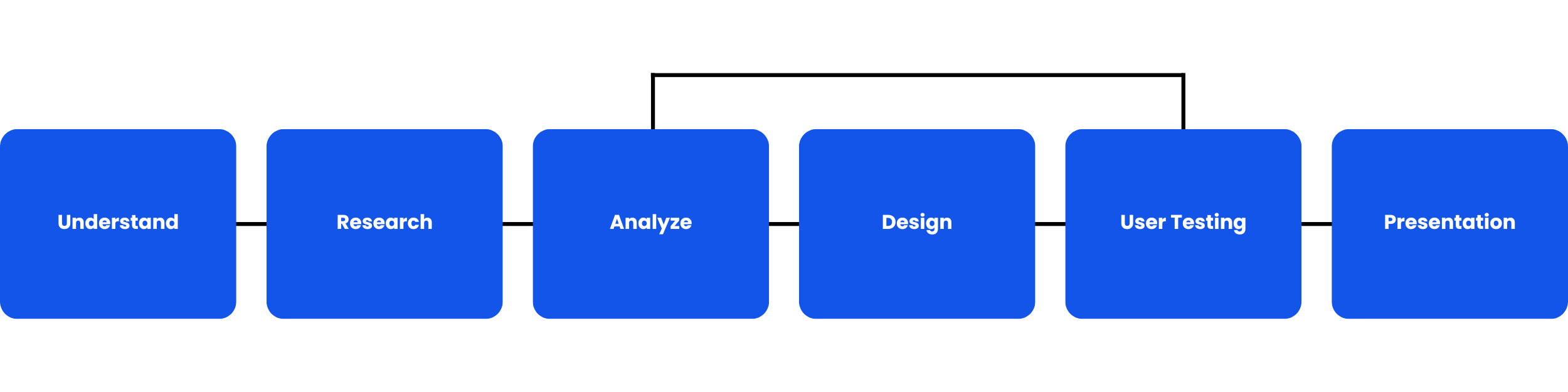
Initial Thinking
Target Users 🧑 — Members of Anthem Blue Cross Blue Shield who regularly schedule doctor appointments. Some members, due to age, may have limited technical skills.
Research Methods 💻 — I will be conducting phone interviews and performing online research.
User Research
Research Goals 📚 — I aim to identify existing apps designed to help users store health information. I plan to analyze user adoption of these apps for organization during doctor visits, and to identify the strengths and weaknesses of current systems.
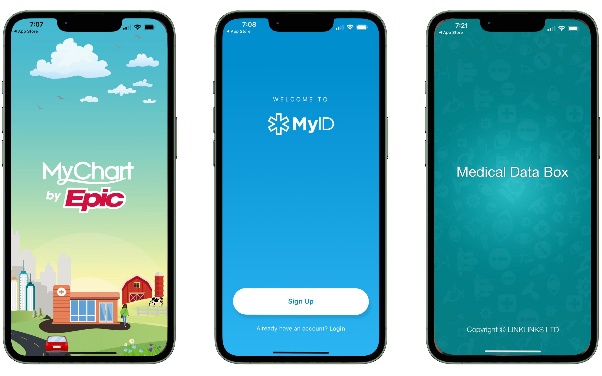
Research #1 (Existing Systems) 📚
- MyChart (iOS and Android App) – The MyChart app, commonly used for accessing medical records and managing healthcare information, has strengths such as user-friendly interface, accessibility to medical records, appointment scheduling, and secure messaging with healthcare providers. However, weaknesses may include occasional technical glitches, varying feature availability across healthcare systems, and potential privacy concerns related to data security practices.
- MyID – Medical ID Profile (iOS and Android App) – The MyID – Medical ID Profile app offers strengths such as easy access to critical medical information in emergencies, customizable profiles with medical conditions and emergency contacts, and integration with emergency services for quick access. However, weaknesses might include dependence on battery-powered devices, potential privacy concerns with sensitive medical data stored on mobile devices, and variability in compatibility with different emergency response systems.
- Medical Data Box (iOS and Android) – The Medical Data Box app offers strengths in centralizing and organizing patient health information for easy access, enhancing patient care during healthcare visits or emergencies, and reducing administrative paperwork through digital record-keeping. However, potential weaknesses include concerns about data security and privacy, variability in compatibility with different healthcare systems, and vulnerability to technical disruptions.
Research #2 (Member Interviews) 📞 — My second step was to understand the users’ needs, pain points, and constraints when managing their health information. Given the quick timeline for this project, I conducted two in-depth user interviews with members of Anthem Blue Cross Blue Shield to learn more about their frustrations with filling out paperwork during doctor visits.
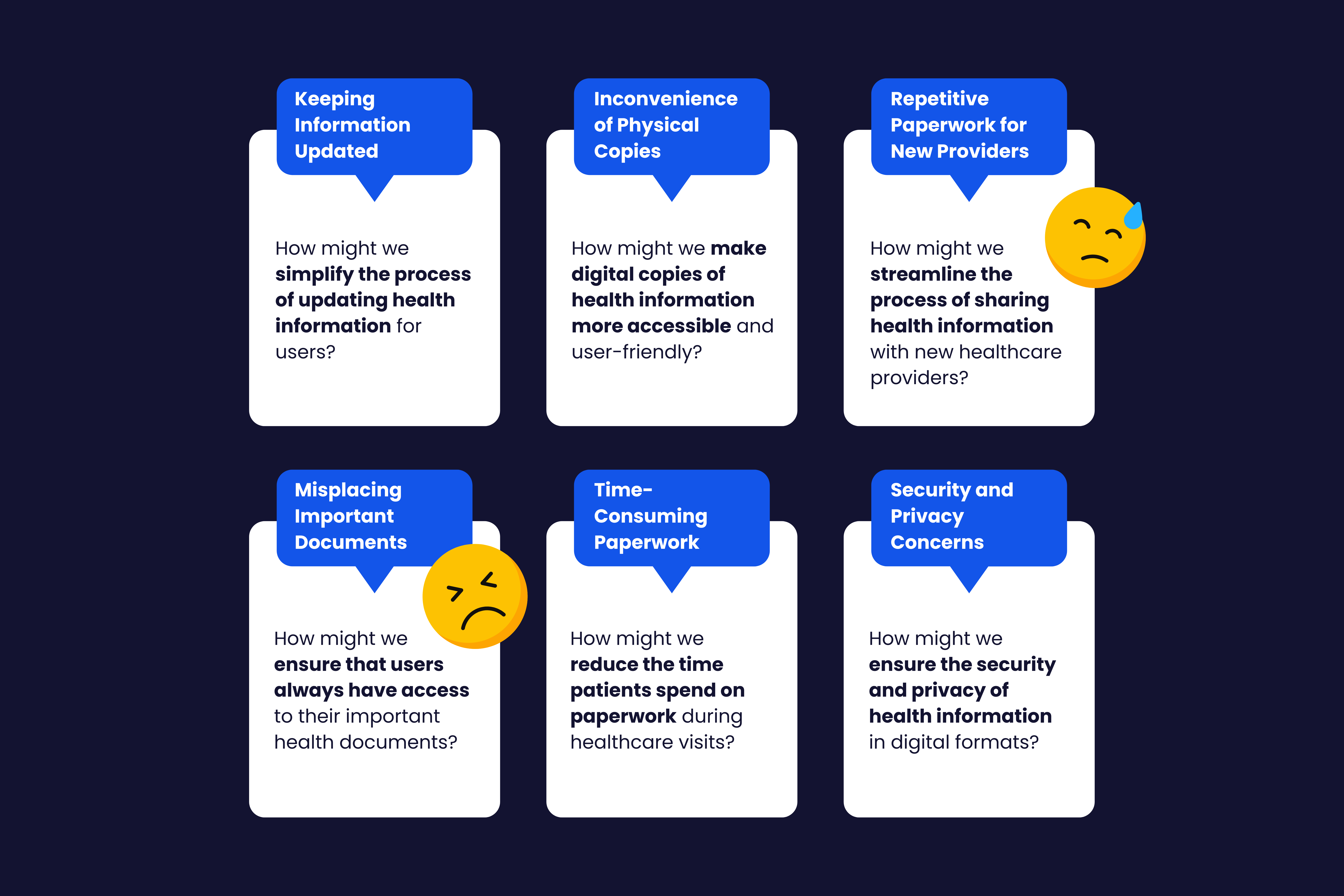
Both users revealed common challenges in managing their health information: difficulty keeping it up-to-date, inconvenience of handling physical records, and frustration with repetitive paperwork. They have experienced misplaced or forgotten documents, causing delays in treatment. Both users see the value in a centralized system for managing their health information, which would save time, reduce stress, and ensure accurate information sharing. However, they have concerns about the security and privacy of their data. Overall, a user-friendly, secure, centralized system would significantly enhance their healthcare experience.
Here are a few statements gathered from their interviews.

Reasearch Findings / Pain Points🤦♀️ — Drawing from the interview results, I identified several pain points and crafted a “How Might We” questions to address these issues in the user experience.
Problem Statement
Many individuals struggle with managing their health information using disparate methods like physical binders and digital notes apps. They face challenges with updating records, carrying documents to appointments, and completing repetitive paperwork. They express a need for a secure, user-friendly centralized system to streamline information access, reduce errors, and enhance communication with healthcare providers.
Design Decision
Q: What is the most efficient digital platform?
A: Mobile Application
Approximately 5.3 billion people worldwide own a mobile phone, keeping it readily accessible at all times. This makes developing a mobile application for Anthem’s members to store their personal health information for upcoming appointments a highly viable solution.
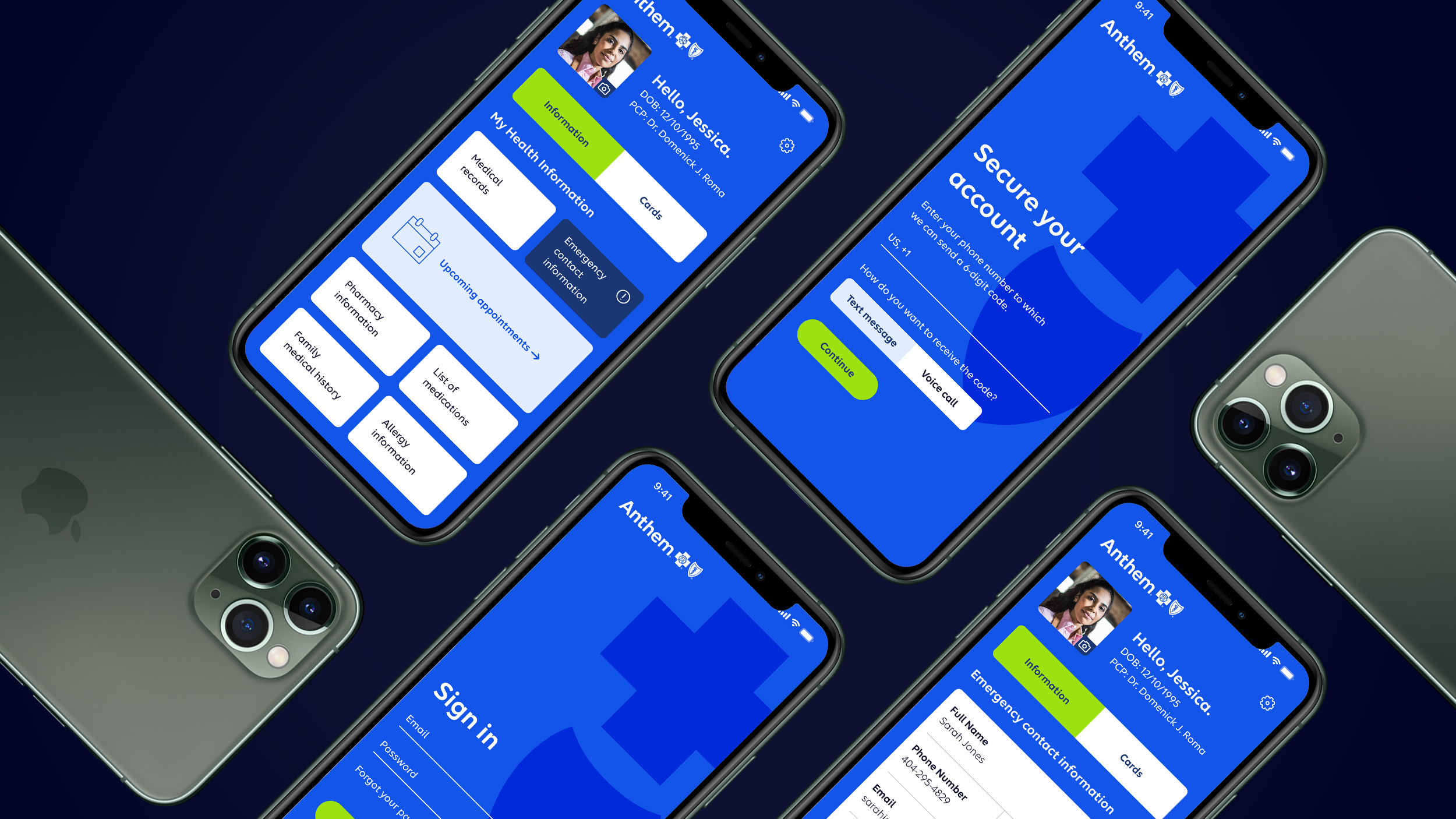
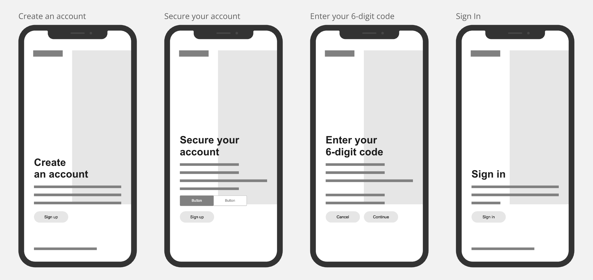
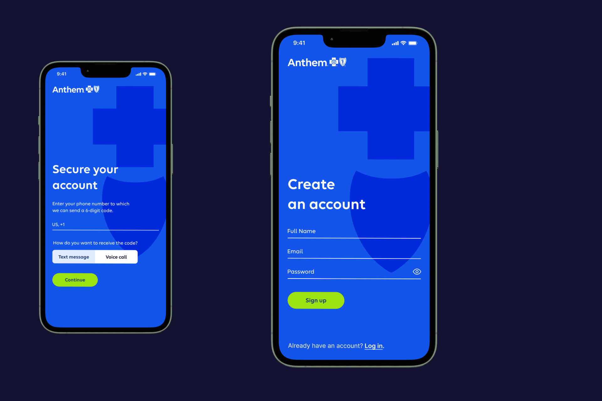
Secure Onboarding Process 🚢 — I devised a strategy to offer a secure and intuitive onboarding experience for users. I crafted a 4-step account creation process, detailed in both low and high fidelity design solutions, which encompasses:
- Account Creation: Users input their full name, email address, and chosen password.
- Account Security: Users enter their phone number to receive a 6-digit verification code via text or phone call.
- Verification Code Entry: Users enter the received code before it expires (within 10 minutes) and proceed by selecting “Continue.”
- Sign-in: Finally, users log in using the email and password they used during account creation.
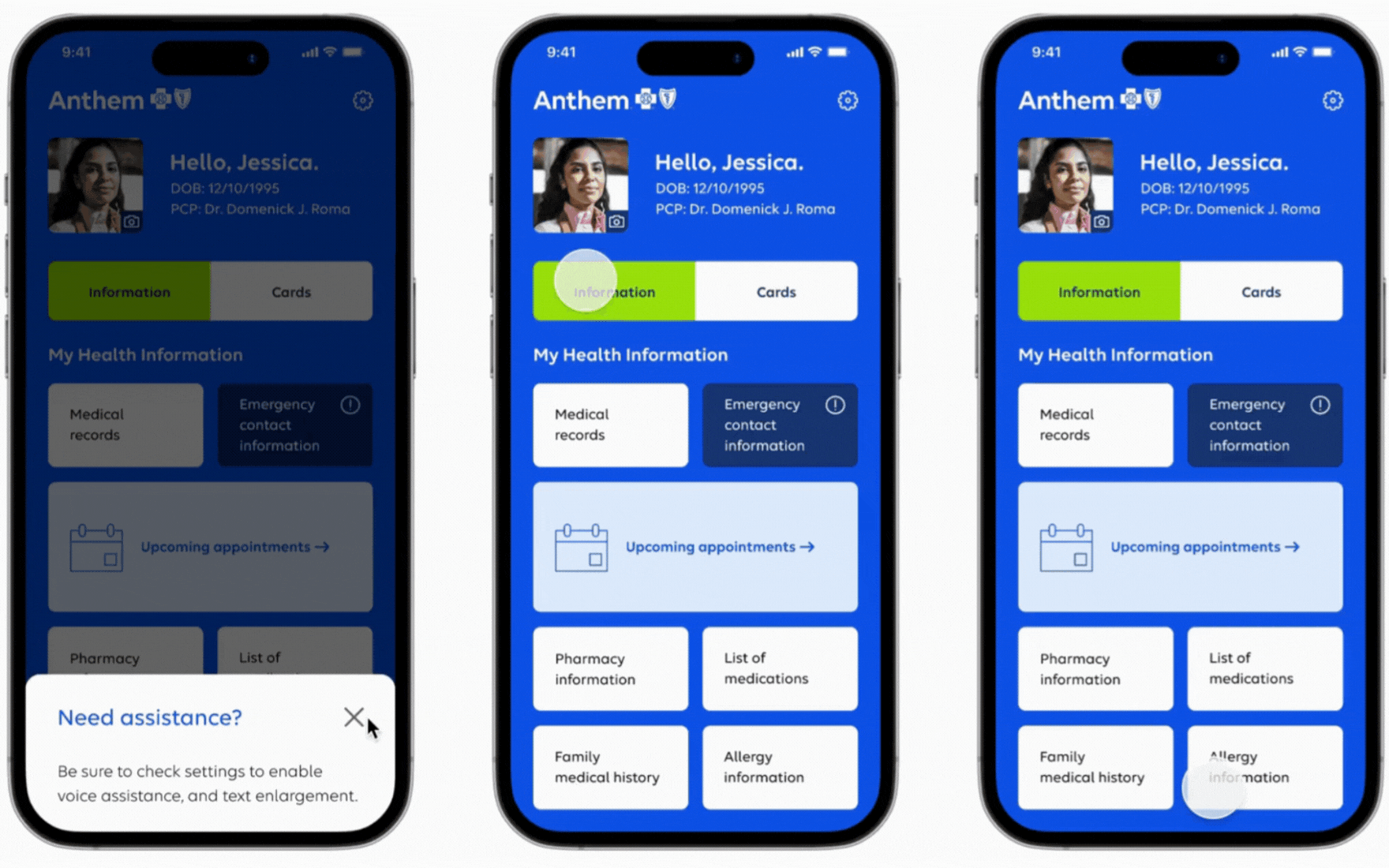
The Evolution of Homepage Organization 🏠 — When I began designing the digital experience, the home screen was my top priority. My goal was to address key user pain points, such as simplifying the process for updating health information and ensuring easy access via mobile devices. I aimed to create a user-friendly page that anyone, regardless of age, could navigate with ease.
Additionally, I wanted the design to feel on-brand and maintain a clean aesthetic to minimize the mental load on users. Incorporating a feature for users to add a photo to their profile/home page was essential because medical information is deeply personal.
Below, you can see the initial wireframes and the progression to the final prototype with slight adjustments. The final design effectively uses hierarchy, with bold and large fonts to indicate importance, and carefully chosen colors for buttons. By placing all vital health sections on the first page without requiring users to scroll, this design is especially appealing to those who are less tech-savvy.
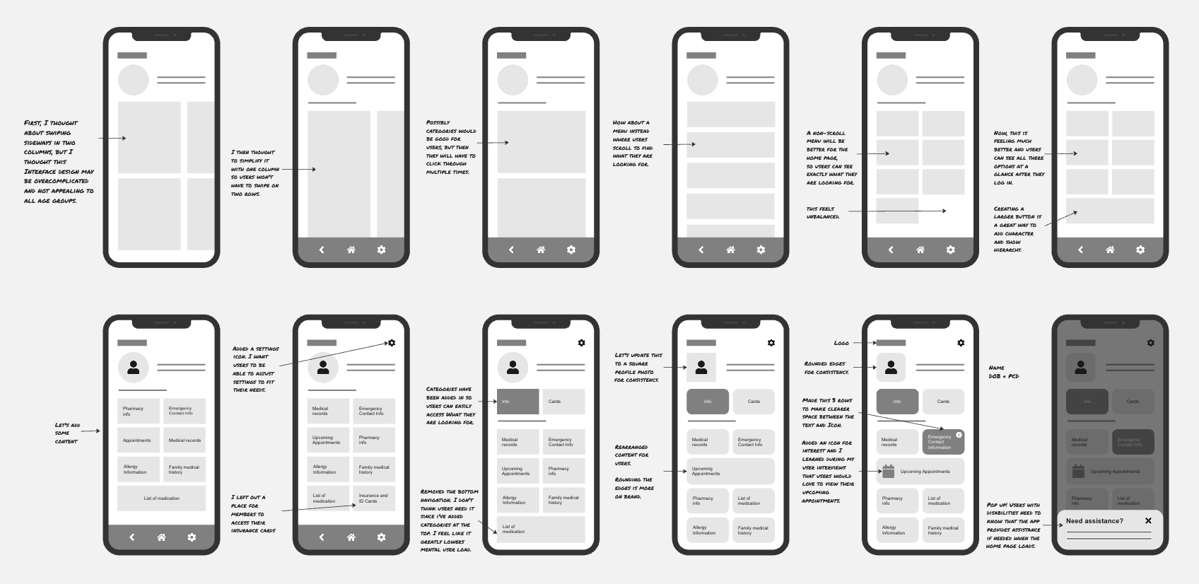
Hassle-Free Health Info Editing ✏️ — Once users access the home page, navigating the app is straightforward. Large buttons make it easy for users to tap the correct option, minimizing accidental clicks. To update any information, users simply click on the desired button and then press the pencil icon in the top or lower corner of each fillable form. Most forms scroll vertically and include a back button at the bottom, reducing the stress of returning to the home page. This design ensures a smooth and intuitive user experience for all.
By implementing these features, the app addresses several key pain points:
- Simplified Updates: Users can easily update their health information with just a few taps, reducing the hassle of keeping records current.
- Easy Navigation: The intuitive layout and large buttons make it easy for users of all ages to navigate, minimizing frustration and errors.
- Minimized User Stress: The inclusion of a back button and vertical scrolling forms reduces the stress associated with navigating back to the home page.
- Personalization: Users can add personal touches, such as profile photos, making the experience more personal and engaging.
- Centralized Information: Vital health sections are accessible from the home page without scrolling, appealing to less tech-savvy users by simplifying access to important information.
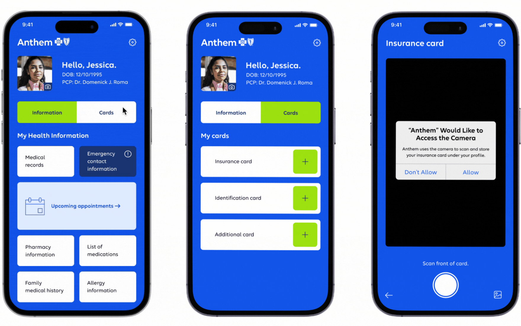
Simple and Effective Methods for Adding Your Insurance Cards 📷 — Users have the choice to either use their phone’s camera to snap a picture of their insurance card or access it digitally online. This flexibility allows users to select the method that suits them best: capturing a physical card visually or retrieving it digitally through online access.
Impact
Members can now attend appointments seamlessly, free from the burden of forgetting paperwork. This initiative aligns with Anthem’s commitment to delivering superior care to members, enhancing customer value, and fostering community health.
User Testing Feedback
- I like being able to see and update all my health info easily.
- It makes filling out forms at the doctor’s office way easier.
- I wish there was a way to upload documents, such as surgery reports and blood test results.
- Having a password and passcode makes me feel safer about my info.
- It’s really easy to use.
- I wish there was a way to sync the information I input with healthcare providers.
- I’m happy it doesn’t have ads and I hope it stays that way.